


 By
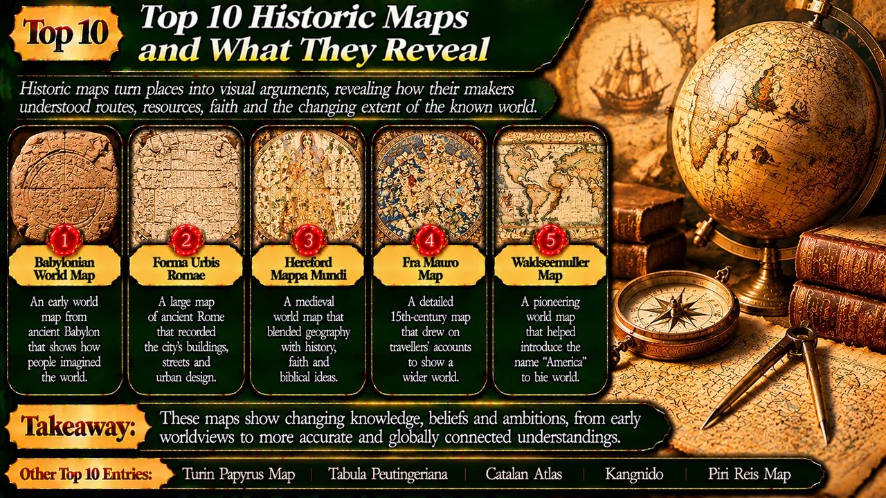
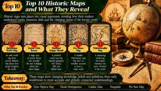
Historic maps turn places into visual arguments, revealing how their makers understood routes, resources, faith and the changing extent of the known world.
A map is selective. It can enlarge a sacred city, straighten a valley or compress a road without being useless for its intended purpose. Comparing old maps only with a modern atlas can therefore miss the questions their makers were trying to answer. Orientation, scale and detail deserve attention alongside the outlines of coasts. [17]
This order weighs historical importance, the distinctiveness of the mapped purpose and the strength of the surviving evidence. A Listverse map list supplies the topic [18]; speculative mysteries give way to identifiable objects and their documented contexts. The selection is not a chronology of steady improvement. A route diagram and a world view can be successful in different ways, even when neither resembles a modern survey.
Key Facts
These ten entries highlight contrasting features and contexts.
Historic Maps and What They Reveal at a Glance
| Rank | Name | Context | Main feature | Notable point |
|---|---|---|---|---|
| 1 | Babylonian World Map | Babylonia | Clay tablet | World view |
| 2 | Turin Papyrus Map | Egypt | Resource landscape | Coloured rocks |
| 3 | Forma Urbis Romae | Rome | Marble city plan | Building detail |
| 4 | Tabula Peutingeriana | Roman routes | Long diagram | Connections |
| 5 | Hereford Mappa Mundi | Hereford | Faith and history | East at top |
| 6 | Catalan Atlas | Majorca | Atlas | Coasts and rulers |
| 7 | Fra Mauro Map | Venice | World map | South at top |
| 8 | Kangnido | Korea | World synthesis | Local emphasis |
| 9 | Piri Reis Map | Ottoman world | Atlantic fragment | Mixed sources |
| 10 | Waldseemuller Map | European printing | World map | Name America |
1. Babylonian World Map
The Babylonian World Map survives on a clay tablet in the British Museum. It presents a circular inhabited world, with Babylon prominent and surrounding water marking a boundary. Written material accompanies the drawing and extends its meaning beyond a bare outline of familiar places. The tablet belongs to the first millennium BC, giving a rare surviving view of how geography and a wider imagined world could be combined. [1] [11]
The map should not be treated as an unsuccessful modern globe. Its arrangement reflects priorities and conventions different from those of a present-day atlas. Features beyond the central circle are not straightforward travel instructions for an ordinary journey. Reading the image alongside its text is essential, while damaged areas and difficult passages limit certainty about every detail. [1] [11]
It leads the list because the surviving tablet makes an ancient view of the world unusually tangible. The important achievement is not precise mileage. It is the decision to organise known places and surrounding realms into a compact visual statement, preserving assumptions that an ordinary list of place names would reveal less clearly.
2. Turin Papyrus Map
The Turin Papyrus Map shows a region associated with quarrying and mineral resources in Egypt's Eastern Desert. The Museo Egizio identifies the main route as Wadi Hammamat, connecting the Nile Valley with the Red Sea. Hills appear in contrasting colours that help distinguish rock types. The map is linked with Amennakht, a scribe from the community of Deir el-Medina, and with the reign of Ramesses IV. [2] [12]
Its purpose helps explain its shape. The maker straightened bends in the valley to fit the landscape onto the available surface. That choice would be a defect in a map intended for exact measurement, but it could improve the presentation of a route and its surrounding resources. Colour, labels and drawn landforms work together, combining practical information with familiar Egyptian conventions for showing hills from the side. [2] [12]
It ranks highly for connecting mapmaking with labour and resource use rather than only with royal territory. Understanding what was selected, simplified or emphasised brings the object closer to its original working context than simply praising it as surprisingly modern.
Related: Top 10 Phantom Islands That Never Existed
3. Forma Urbis Romae
The Forma Urbis Romae was a vast marble plan of ancient Rome, carved in the early third century AD. Its marble surface originally filled part of the Temple of Peace complex. Unlike a symbolic world map, it represented the city's built fabric in striking detail, from major public structures to rooms, courtyards and stairs. Its viewpoint reduced a crowded urban landscape to an arrangement that could be examined as a plan. [3] [16]
Only fragments survive, so reconstruction is a demanding task. Scholars compare shapes, labels and known archaeology to propose joins and locations. Stanford's research project used digital photographs and three-dimensional models to make those comparisons more accessible. The surviving pieces are evidence, but the proposed arrangement of missing areas remains an interpretation that must be tested. [3] [16]
It earns its place because the level of urban detail contrasts so sharply with its damaged condition. The map records more than famous buildings. Small spaces can reveal how shops, housing and public amenities fitted together, making a monumental display valuable for studying ordinary parts of the city as well as its grandest landmarks.
4. Tabula Peutingeriana
The Tabula Peutingeriana is a surviving hand-drawn copy of an older road representation associated with the Roman world. Its long, narrow format compresses geography into an unusual shape. Routes, stopping places and distances receive attention, while the familiar proportions of seas and land do not. It is better understood as a guide to connections than as a picture designed to reproduce the world at one consistent scale. [4] [13]
The surviving copy is later than much of the information it preserves. That distinction matters: an old place name in a later object does not automatically date the physical sheet to the same period. Scholars study layers of content and copying history when interpreting it. Its value lies partly in showing relationships among places, including how travellers could imagine moving through a very extensive web of roads and settlements. [4] [13]
Its rank reflects the clarity with which purpose reshapes space. Modern travellers accept compressed diagrams when connections matter more than geographic resemblance. Its distinctive format belongs to a particular history of travel, copying and the preservation of older geographic knowledge.
5. Hereford Mappa Mundi
This celebrated Hereford map places the inhabited world within a Christian account of history. East is at the top, and Jerusalem occupies the centre. Biblical events, classical stories, cities and unusual creatures share the surface. The map is not merely a distorted attempt at navigation. It arranges places within a larger moral and historical framework, presenting geography as part of a meaningful account of humanity's place in creation. [5] [14]
Related: Top 10 Most Bizarre Phobias: Strange Fears That Exist
Its images require interpretation: a creature shown on the map is evidence of a belief or literary tradition, not proof that the creature existed. Even real cities can be enlarged or embellished for reasons of importance rather than physical size. Paris and Rome receive attention that a uniform geographic scale would not explain. [5] [14]
It ranks for making the mapmaker's priorities exceptionally visible. A viewer can compare spatial position with spiritual significance instead of asking only whether a coastline is accurate. That does not place the object outside the history of geography. It broadens the enquiry to include what an audience wanted a world map to teach and remember.
6. Catalan Atlas
The Catalan Atlas combines the practical inheritance of Mediterranean sea charts with a wide-ranging presentation of the world. It is associated with the Majorcan mapmaker Abraham Cresques and his workshop. Coastal detail sits alongside rulers, routes and information drawn from travel accounts. The result is not a simple choice between navigation and illustration, but a work in which different kinds of geographic knowledge appear together. [6]
Its portrayal of distant lands helped communicate places that many viewers would never visit. Mansa Musa, the ruler associated with the Mali Empire, appears as a striking figure of wealth. Such an image reveals European knowledge and imagination about Africa, but it cannot stand alone as a complete account of African societies. The atlas must be read both for the information it preserves and for the perspective shaping its selection. [6]
It earns its place by joining detailed coastlines with a broader cultural view. The contrast inside one object is more revealing than treating every old map as equally symbolic or equally practical. Different panels and features can serve different purposes, reminding readers that a map's authority may rest on several traditions brought together by skilled makers.
7. Fra Mauro Map
Fra Mauro's world map emerged from a Venetian setting in which travel reports and inherited learning could meet. The large circular work places south at the top. That orientation is not an error waiting for a later mapmaker to correct. North-up is a convention, and the map offers a useful reminder that an arrangement familiar to modern readers is not a natural requirement of geographic representation. [7]
Related: The Science Behind Auroras: How Solar Winds Create Colorful Skies
Fra Mauro and his collaborators drew on varied sources, including information connected with maritime travel. Text across the map comments on places and on questions about the shape and extent of the known world. The treatment of Africa is especially important in debates about geographic knowledge before later European voyages. Those passages deserve contextual reading rather than being recruited as proof of a mysterious lost global civilisation. [7]
Its position reflects the map as a work of comparison and argument. A maker could weigh reports instead of simply repeating an inherited authority. Studying the choices reveals a more interesting history than dividing all old maps into either astonishingly accurate or hopelessly wrong.
8. Kangnido
Kangnido brings Chinese and other geographic traditions into a map made in early Joseon Korea. Its broad world view includes recognisable parts of Africa and Europe alongside a much more detailed East Asian region. Korea occupies a prominent position, showing that a world map can combine knowledge gathered across distances with the priorities of the place in which the final object is produced. [8]
The original is known through later surviving copies rather than one untouched sheet that can settle every question. Copying can preserve information while introducing changes, so researchers compare versions carefully. The map's treatment of distant lands reflects the movement of geographic knowledge across linguistic and political boundaries. That exchange did not require its final makers to have personally surveyed every coast that appears in the drawing. [8]
It ranks for widening a discussion often dominated by European examples. Its value lies in the interaction of local emphasis and far-reaching information, not in pretending that its proportions match a modern atlas. The differences between regions are part of the evidence, helping historians ask whose knowledge was available and what the map's makers considered most important.
9. Piri Reis Map
The surviving Piri Reis map is a fragment of an Ottoman world map associated with the admiral and cartographer Piri Reis. It shows parts of the Atlantic world, including the western coasts of Africa and portions of the Americas. Its maker drew on several sources, bringing different bodies of maritime knowledge together. The fragment is important because it preserves an early attempt to organise information from expanding Atlantic travel. [9]
Related: Top 10 Facts About Dogs
Its fame has also attracted unsupported claims, especially the suggestion that it accurately portrays an ice-free Antarctica. The surviving outlines do not require that explanation. Differences in source material, coastal interpretation and the limits of contemporary knowledge provide a more responsible starting point. A puzzling feature should be examined against the map's known context before it is treated as evidence for knowledge from an otherwise unattested civilisation. [9]
Combining sources was a practical achievement, but it could also combine inconsistencies. Reading the work carefully is more rewarding than searching for one spectacular secret, and uncertainty is a legitimate conclusion when the surviving material cannot resolve a question.
10. Waldseemuller Map
Martin Waldseemuller's world map of 1507 is famous for applying the name America to land in the western Atlantic. The name honoured Amerigo Vespucci and reflected a changing European understanding of the newly encountered lands. The Library of Congress holds the surviving copy. Its importance lies not in discovering an empty world, but in recording how European geographic ideas and naming practices responded to places already inhabited. [10] [15]
The map drew on the geographic learning available to its makers and represented the western lands as distinct from Asia. That was a consequential interpretation, not a guarantee that every outline was correct. The printed format also mattered: information could circulate through multiple impressions rather than relying only on individually drawn copies. Survival is selective, so the existence of one preserved example should not be confused with the original extent of distribution. [10] [15]
It closes the list because naming can outlast the uncertainty of a particular map. The object shows mapmaking shaping how later readers divide and discuss the world, not merely recording an agreed geography that existed independently of the act of drawing it.
Conclusion
These maps are evidence of purposes as well as places. Resource planning, travel, faith and new information each shaped what a maker chose to show. Their strengths and mistakes connect with phantom islands, while historic libraries highlight the institutions that preserve geographic knowledge. Reading a map critically means asking who made it, what it was for and what evidence it used, not assuming that an old-looking outline must conceal a mystery.
- ^ [1] "Babylonian World Map". Wikipedia. Read
- ^ [2] "Turin Papyrus Map". Wikipedia. Read
- ^ [3] "Forma Urbis Romae". Wikipedia. Read
- ^ [4] "Tabula Peutingeriana". Wikipedia. Read
- ^ [5] "Hereford Mappa Mundi". Wikipedia. Read
- ^ [6] "Catalan Atlas". Wikipedia. Read
- ^ [7] "Fra Mauro Map". Wikipedia. Read
- ^ [8] "Kangnido". Wikipedia. Read
- ^ [9] "Piri Reis Map". Wikipedia. Read
- ^ [10] "Waldseemuller Map". Wikipedia. Read
- ^ [11] "Map of the World". British Museum. Read
- ^ [12] "Goldmine Papyrus". Museo Egizio. Read
- ^ [13] "Tabula Peutingeriana". UNESCO. Read
- ^ [14] "Hereford Mappa Mundi". Mappa Mundi Hereford. Read
- ^ [15] "1507 World Map". Library of Congress. Read
- ^ [16] "Stanford Digital Forma Urbis Romae Project". Stanford University. Read
- ^ [17] "Cartography". Encyclopaedia Britannica. Read
- ^ [18] "Topic inspiration: Historic Maps and What They Reveal". Listverse. Read















Discussion
Log in with