




Top 10 Historic Colours and the Materials Behind Them
 By Dhiraj Sharma · Published
Share Post
Loading…
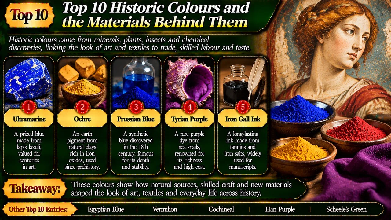
Historic colours came from minerals, plants, insects and chemical discoveries, linking the look of art and textiles to trade, skilled labour and taste.
The same red or blue can conceal very different materials. Some colours are insoluble particles mixed into paint; others are dyes that colour fibres. Ink brings another set of ingredients and purposes. Treating them all as interchangeable would hide the practical choices made by painters, dyers and people who wrote by hand.
The order considers cultural influence, the reach of trade and the importance of each material to later practice. A Listverse pigment list provides the topic [19], but better-documented materials replace several sensational examples. This is a history of colour, not a guide to making pigments: some entries contain hazardous substances that should not be handled as craft ingredients.
Key Facts
These ten entries highlight contrasting features and contexts.
Historic Colours and the Materials Behind Them at a Glance
| Rank | Name | Context | Main feature | Notable point |
|---|---|---|---|---|
| 1 | Ultramarine | Stone | Lapis lazuli | Imported blue |
| 2 | Egyptian Blue | Manufacture | Copper silicate | Ancient craft |
| 3 | Ochre | Earth | Iron minerals | Many shades |
| 4 | Vermilion | Red | Mercury sulphide | Conservation risk |
| 5 | Prussian Blue | Blue | Iron compounds | Wide influence |
| 6 | Cochineal | Dye | Insect colourant | American expertise |
| 7 | Tyrian Purple | Dye | Marine molluscs | Prestige cloth |
| 8 | Han Purple | China | Barium copper silicate | Manufactured purple |
| 9 | Scheele's Green | Green | Copper arsenite | Arsenic hazard |
| 10 | Iron Gall Ink | Writing | Iron and tannins | Fragile records |
1. Ultramarine
Natural ultramarine begins with lapis lazuli, a blue stone associated especially with the mines of what is now Afghanistan. Producing a strong pigment required separating the valuable blue material from less useful components. The result travelled far from its source and became a prized choice for painters. [1] [11]
European painters used the rich blue in important passages, including religious clothing. Its value could affect workshop decisions and agreements with patrons. The name refers to its arrival from beyond the sea, making trade part of the colour's identity. A manufactured alternative emerged in the nineteenth century and widened access to a closely related blue. Natural and artificial ultramarine should not be assumed identical merely because their names overlap. [1] [11]
It leads the list because a small painted area can embody a long chain of mining, transport and careful preparation. The blue is visually immediate, but the labour behind it is not. Recognising that chain changes how a viewer understands both a celebrated painting and the materials budget of an artist's workshop.
2. Egyptian Blue
Egyptian blue is a manufactured copper-containing pigment, not simply a naturally blue rock ground into powder. Its key coloured compound is calcium copper silicate. Ancient craftspeople produced a material that could be used on objects, paintings and architectural decoration. Its presence demonstrates considerable control of materials, even though its makers did not explain their work through the vocabulary of modern chemistry. [2] [12]
The pigment spread beyond Egypt into other ancient Mediterranean settings. Preparation and grain size affected its appearance and handling, so its history involves workshop knowledge as well as the supply of ingredients. Modern researchers can detect its strong near-infrared luminescence, which can reveal traces that are difficult to see under ordinary illumination. That analytical property helps distinguish the material from another substance that merely looks blue. [2] [12]
Its high rank reflects an early and influential example of making a desired colour rather than only collecting it. The pigment also connects ancient technique with present-day conservation. A faded surface may retain evidence that the unaided eye misses, allowing careful analysis to recover part of the object's earlier appearance without repainting it.
Related: Top 10 Most Bizarre Phobias: Strange Fears That Exist
3. Ochre
Ochre is a family of earth pigments whose colours depend largely on iron-bearing minerals. Yellow, red and brown varieties need not come from the same deposit or have identical composition. The term names a broad material group rather than one perfectly uniform substance. Its availability in many regions helped make it important to people working with stone, skin, wood and painted surfaces. [3] [13]
Archaeological evidence places ochre far back in human cultural history, including prehistoric art and the treatment of objects and bodies. A piece of coloured earth does not, by itself, prove a particular ritual meaning. Context matters: wear, residues, associated tools and the location of a find help researchers distinguish possible uses. Its long history is secure without assigning one shared symbolic message to every red mark left by ancient people. [3] [13]
Ochre ranks for accessibility and endurance rather than rarity. Unlike a luxury blue imported across continents, an earth pigment could be obtained closer to home. The contrast is revealing: a colour's significance need not depend on an exotic origin. Familiar local materials can underpin artistic traditions that last far longer than individual kingdoms or fashions.
4. Vermilion
Vermilion is a vivid red associated with mercury sulphide. The same compound occurs naturally as the mineral cinnabar, while manufactured pigment offered another route to a strong red. Neither a beautiful colour nor an ancient history makes a mercury-containing substance safe to use casually. [4] [14]
The red appears across major artistic traditions, including European painting and East Asian decoration. Its dense colour made it valuable for emphatic passages and decorated surfaces. Light, impurities and environmental conditions can alter its appearance, sometimes producing darkening. Conservation therefore asks not only what colour a surface looks now, but what material was used and what changes it may have undergone since the object was made. [4] [14]
It earns its place through the combination of visual power, wide use and material vulnerability. A historic red can be culturally important and chemically troublesome at the same time. Understanding vermilion encourages viewers to distinguish original artistic choices from later alteration, rather than assuming that every dark passage represents exactly the colour first applied.
5. Prussian Blue
Prussian blue emerged in the early eighteenth century and became an influential manufactured pigment. It belongs to a class of iron-containing compounds with an intense blue appearance. Unlike ultramarine, it did not depend on imported lapis lazuli. That difference gave painters another route to a strong blue and helped change the range of affordable materials available to artists and decorative workshops. [5] [15]
Related: The Evolution of Stranger Things: Seasons, Themes, and Characters
Its influence was not confined to Europe. Japanese printmakers used imported Prussian blue to striking effect, including landscapes associated with Hokusai. The material also became important in cyanotype photography, where a blue image forms through an iron-based process. A painted passage and a blueprint can therefore share a chemical family while belonging to different practical traditions and methods of image making. [5] [15]
Its position reflects the reach of one material across painting, printmaking and photography. The story is broader than an appealing tale of discovery. A colour becomes historically consequential when manufacture, distribution and skilled use make it available to new groups. Prussian blue shows that the history of art materials also belongs to industrial and commercial history.
6. Cochineal
Cochineal colour comes from insects associated with prickly pear cacti. The valued red is linked to carminic acid, and the insects were cultivated and processed in the Americas before European colonisation. The colour's origin is biological, but the finished dye is also the result of substantial human knowledge and labour. Describing it only as an unusual ingredient would miss that established craft tradition. [6] [16]
After transatlantic trade expanded, cochineal became an important export and a sought-after source of red for textiles. Carmine, a pigment prepared from the colourant, also found uses in painting. Dye and pigment are related products, not automatically the same material in a different container. The colour achieved on cloth also depends on fibre and treatment, so the insect's origin alone does not determine the final shade. [6] [16]
Cochineal ranks for connecting Indigenous expertise with a much wider trade in colour. Its history shows how a valuable material can travel while the knowledge of its original producers receives less attention. Following that history restores people, cultivation and skilled preparation to a story often reduced to the surprise that a red can come from insects.
7. Tyrian Purple
Tyrian purple was produced from marine molluscs and became associated with prestige in the ancient Mediterranean. The name recalls Tyre, but production was not confined to a single city. Different species and methods could yield different hues. The celebrated colour is therefore better understood as a tradition of dye making than as one modern colour swatch with an eternally fixed appearance. [7]
Related: Chernobyl Miniseries: Stories of Tragedy of a Nuclear Catastrophe, Heroism and Sacrifice
Processing the animals demanded labour and specialised knowledge, helping make the dyed cloth valuable. Rules and customs linked certain purple garments with high status in different societies, including Rome. Those associations changed over time; it would be misleading to claim that every purple object always belonged to an emperor. The cultural meaning rested on who could obtain, wear or control the fabric as well as on its visible colour. [7]
Its place reflects the unusually strong link between a dye and public authority. The important story is not an unverifiable calculation of how many animals supplied one robe. It is the relationship between scarce material, organised work and social distinction. A garment could announce rank before its wearer spoke, turning colour into a visible expression of power.
8. Han Purple
Han purple is an artificial barium copper silicate pigment associated with ancient China. It is chemically distinct from the related material known as Han blue. The names connect the colours with Chinese history, but they should not be treated as guarantees that every example dates from precisely the same dynasty. Archaeological context and material analysis remain necessary for identifying where and when a pigment was used. [8]
The pigment is known from objects and painted surfaces, including material associated with the terracotta figures near the tomb of Qin Shi Huang. That link helps reveal how colourful ancient sculpture could be before paint was lost. Modern studies of unusual physical behaviour in the compound are a separate subject. They do not establish that ancient painters were deliberately exploiting advanced modern physics when they selected a purple. [8]
Han purple earns a place for showing that ancient manufactured colours had more than one regional history. Egyptian blue offers a useful comparison, but chemical resemblance does not by itself prove direct transmission of a recipe. Independent evidence is needed before similarities in materials become a confident claim about contact between distant workshops.
9. Scheele's Green
Scheele's green is a copper arsenite pigment named after the chemist Carl Wilhelm Scheele. Its attractive green brought it into paints and decorative uses, including wallpapers. The problem lay in its arsenic content. An appealing surface could introduce a hazardous material into ordinary surroundings, demonstrating how consumer enthusiasm can outrun understanding of the risks associated with a new colour. [9] [17]
Related: The Family Man: A Spy Thriller of Modern India Balancing Family Life and National Security
Historical debate about arsenic-bearing wallpapers involves both the pigment itself and the conditions in which decorated rooms were used. It should not be reduced to one tidy explanation of every illness reported in such a room. Nor does the existence of a green wallpaper prove a famous person's cause of death. Establishing an exposure, identifying its consequences and assigning responsibility are different questions that require different kinds of evidence. [9] [17]
It ranks as a cautionary contrast to the pursuit of brighter and cheaper colours. Material history includes the consequences of adoption, not only the achievement of a desirable shade. A conservation label can identify an old pigment without recommending its use, and readers should leave the examination of suspect historic materials to appropriately trained specialists.
10. Iron Gall Ink
Iron gall ink was widely used for handwriting in Europe and beyond. Its ingredients bring together iron salts and tannin-rich plant material, often from oak galls, with a binder such as gum arabic. The resulting dark writing suited letters, legal records, music and books. It belongs in this list as an ink tradition rather than as another pigment applied in the same manner as paint. [10] [18]
Its usefulness did not guarantee perfect long-term stability. Some formulations damage the support on which they were written, contributing to cracking or loss around dark lines. Paper composition, ingredient balance and storage conditions all affect the result. Not every page written with iron gall ink deteriorates in the same way, so conservation decisions require assessment of the particular object rather than a single universal remedy. [10] [18]
The ink closes the list because it makes colour part of the survival of knowledge. A dark line can preserve a thought while also creating a conservation challenge. Its history connects the ordinary act of writing with chemistry, craft and the patient work needed to keep fragile records legible for later readers.
Conclusion
Colour history joins appearance to hidden labour, travel and risk. A blue passage or a red garment can reveal choices about cost, status and technique, not just taste. Explore prehistoric cave art for some early uses of coloured materials, or books that changed the world for objects whose survival depends partly on inks and supports. Identifying a material deepens interpretation without reducing art to a list of ingredients.
- ^ [1] "Ultramarine". Wikipedia. Read
- ^ [2] "Egyptian Blue". Wikipedia. Read
- ^ [3] "Ochre". Wikipedia. Read
- ^ [4] "Vermilion". Wikipedia. Read
- ^ [5] "Prussian Blue". Wikipedia. Read
- ^ [6] "Cochineal". Wikipedia. Read
- ^ [7] "Tyrian Purple". Wikipedia. Read
- ^ [8] "Han Purple". Wikipedia. Read
- ^ [9] "Scheele's Green". Wikipedia. Read
- ^ [10] "Iron Gall Ink". Wikipedia. Read
- ^ [11] "Ultramarine blue, natural". MFA Boston, CAMEO. Read
- ^ [12] "Egyptian Blue". MFA Boston, CAMEO. Read
- ^ [13] "Ocher". MFA Boston, CAMEO. Read
- ^ [14] "Vermilion". MFA Boston, CAMEO. Read
- ^ [15] "Prussian Blue". MFA Boston, CAMEO. Read
- ^ [16] "Cochineal". MFA Boston, CAMEO. Read
- ^ [17] "Scheele's Green". MFA Boston, CAMEO. Read
- ^ [18] "Iron Gall Ink". MFA Boston, CAMEO. Read
- ^ [19] "Topic inspiration: Historic Colours and the Materials Behind Them". Listverse. Read



















Discussion
Log in with