




Top 10 Optical Illusions That Reveal How Vision Works
 By Dhiraj Sharma · Published
Share Post
Loading…
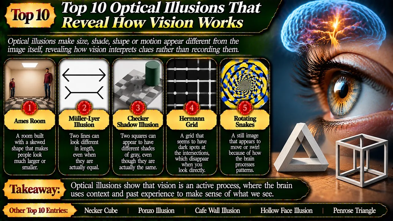
Optical illusions make size, shade, shape or motion appear different from the image itself, revealing how vision interprets clues rather than recording them.
A drawing can remain unchanged while its appearance shifts. A room can look ordinary from one viewpoint yet distort the apparent height of its occupants. These effects are not evidence that the eyes are useless. They reveal the normally helpful shortcuts through which people judge depth, edges and surfaces from incomplete information.
Our order weighs explanatory value, clarity of demonstration and the variety of visual processes represented. The Listverse topic supplies the starting point [18]; more precisely documented examples replace ambiguous novelty entries. Explanations below distinguish established observations from competing accounts of why an effect occurs. No illusion here diagnoses personality, intelligence or a favoured side of the brain.
Key Facts
These ten entries highlight contrasting features and contexts.
Optical Illusions That Reveal How Vision Works at a Glance
| Rank | Name | Context | Main feature | Notable point |
|---|---|---|---|---|
| 1 | Ames Room | Depth | Distorted room | Apparent size |
| 2 | Necker Cube | Ambiguity | Wire cube | Reversing depth |
| 3 | Muller-Lyer Illusion | Length | Contrasting fins | Equal spans |
| 4 | Ponzo Illusion | Perspective | Converging lines | Apparent size |
| 5 | Checker Shadow Illusion | Lightness | Shadow context | Equal grey |
| 6 | Cafe Wall Illusion | Orientation | Staggered tiles | Apparent tilt |
| 7 | Hermann Grid | Contrast | Crossing bands | Fleeting patches |
| 8 | Hollow Face Illusion | Familiarity | Inward mask | Apparent projection |
| 9 | Penrose Triangle | Geometry | Impossible loop | Local plausibility |
| 10 | Rotating Snakes | Motion | Static circles | Apparent rotation |
1. Ames Room
An Ames room makes people of similar height look dramatically different in size. Viewed through a carefully chosen opening, its walls and floor seem to belong to an ordinary rectangular room. In fact, the geometry is distorted. One back corner lies farther from the observer than the other, but the restricted viewpoint conceals the clues that would normally expose the arrangement. [1]
A person at the more distant corner occupies a smaller angle of vision. If the viewer interprets both people as standing at a comparable distance, that difference becomes an apparent difference in height. Moving across the room can consequently seem to make an occupant grow or shrink. The effect depends on how the scene is viewed; it is not a physical alteration of the people within it. [1]
It leads the list because it turns a familiar assumption about rooms into a clear test of depth judgement. Perspective is useful precisely because it usually corresponds to a stable world. The Ames room constructs an exception, showing why a persuasive view from one position need not reveal the actual layout.
2. Necker Cube
The Necker cube is a wire-frame drawing whose edges can be read as belonging to different orientations. One face appears nearer, then another takes its place. Neither interpretation requires the lines on the page to move. The drawing leaves important depth information unspecified, so more than one coherent reading remains possible. A viewer may experience alternation even while looking at the same unchanging figure. [2] [11]
Its name comes from Louis Albert Necker, who discussed the figure while studying crystalline forms. Unlike a drawing of an impossible object, each main interpretation can describe a real cube. What is unstable is the choice between them. Adding shading or hiding selected edges can favour one reading by providing the depth cues that the simple wire outline deliberately withholds from the observer. [2] [11]
The cube earns its high rank by separating ambiguity from error. Vision need not produce an impossible answer to become uncertain. Sometimes the available evidence genuinely supports alternatives. The experience of switching between them helps explain why perception is an active interpretation, rather than a passive inventory of lines and corners.
Related: Top 10 Most Bizarre Phobias: Strange Fears That Exist
3. Muller-Lyer Illusion
In a familiar version of the Muller-Lyer illusion, equal central lines carry differently oriented fins at their ends. The line with outward-spreading fins often looks longer than the one with inward-pointing arrowheads. Measuring the central spans reveals the equality that appearance obscures. The surrounding marks influence the judgement, although they do not add to the actual length being compared. [3] [16]
Franz Carl Muller-Lyer gave the illusion its name. Researchers have used variations to investigate how context affects estimates of extent. Perspective-based explanations compare the fins with inward and outward corners, but that is not the only account. Other approaches examine how nearby contours and the distribution of the whole figure influence the apparent positions of endpoints. There is no need to pretend that a single brief explanation settles every variant. [3] [16]
The effect ranks here because the gap between a measurement and a visual judgement is easy to state. It also warns against broad claims about cultural groups or individual ability from one drawing. An illusion is a controlled example to study, not a ready-made ranking of whose eyes work best.
4. Ponzo Illusion
The Ponzo illusion places equal marks within converging lines, often drawn to resemble railway tracks. A mark nearer the apparent distance can look larger than an equal mark lower in the picture. The converging context suggests depth, and the viewer interprets the upper mark in relation to that implied space rather than comparing the marks as isolated patches on a flat surface. [4] [12]
One influential explanation invokes size constancy. In ordinary viewing, a distant object must be larger to cast an image as large as that of a nearby object. Applying that useful relationship to a flat drawing can produce a misleading size impression. The illusion also appears in altered orientations and arrangements, so perspective is an important explanatory approach rather than a universal account of every possible version. [4] [12]
It belongs near the top for making the role of context especially visible. A pair of bare lines can be easy to compare, yet the addition of a plausible setting changes the task. The lesson is not that all depth cues are deceptive, but that a cue can influence judgement even when it comes from a drawing.
5. Checker Shadow Illusion
Edward Adelson's checker shadow image shows a chequered surface partly covered by a cylinder's shadow. Two selected squares appear to differ sharply in shade, yet their displayed grey values are identical. The darker-looking square sits in one context and the lighter-looking square in another. Isolating or connecting the patches makes their physical equality much easier to verify than simply staring at the complete scene. [5] [17]
Related: Top 10 Facts About Dogs
The image exploits the distinction between light reaching the eye and the apparent reflectance of a surface. In everyday life a white object in shadow can send less light towards us than a dark object in sunshine. Vision uses surrounding patterns and the apparent shadow to make sense of such differences. In this carefully arranged picture, those inferences produce the surprising comparison between equal grey patches. [5] [17]
It ranks for exposing a subtle but important point: perceived lightness is not a direct reading of a pixel value. The illusion does not establish that colour has no physical basis. It shows why illumination and surroundings must be considered when explaining the appearance of a particular surface.
6. Cafe Wall Illusion
Alternating dark and pale tiles form offset rows, with narrow separating bands between them. Although the separating lines are parallel, they can appear to tilt in alternating directions. The visual disturbance comes from the relationship between neighbouring light and dark regions. A ruler or a carefully placed straight edge makes the underlying alignment clear, without changing the pattern that generates the apparent slant. [6] [13]
The familiar name is linked to a tiled wall in Bristol studied by Richard Gregory and colleagues, although related versions were reported earlier. The contrast and the width of the separating bands affect the illusion. Explanations involve how local edges and brightness differences contribute to the final judgement of orientation. Calling it merely a mistake about perspective would miss the importance of the small repeated structures. [6] [13]
Its place reflects the way a modest decorative pattern can challenge confidence in straight lines. It is a useful comparison with the Muller-Lyer figure: context changes a judgement in both cases, but the apparent property differs. One concerns length, while the cafe wall concerns the direction in which a line seems to run.
7. Hermann Grid
The classic Hermann grid has pale bands crossing on a dark background. Grey patches seem to appear near intersections away from the point being examined. Looking directly at an intersection usually makes its patch disappear. The physical grid has not acquired extra spots. The effect is tied to how the pattern is processed across the visual field, including the differences between central and more peripheral viewing. [7] [14]
Related: Top 10 Tallest Buildings in the World
It should be distinguished from the scintillating grid, a related arrangement that adds bright discs and can produce apparently flashing dark spots. The two effects are often confused in popular accounts. A traditional explanation of the Hermann grid relies on interactions among neighbouring light-sensitive pathways, but changes to line shape and orientation show that a simple retinal account is not a complete explanation of every observation. [7] [14]
The grid earns a place for making uncertainty in scientific explanation part of the story. Naming an illusion does not mean its mechanism has been reduced to one sentence. Distinguishing closely related demonstrations is also essential: an attractive explanation of one arrangement may not automatically explain its neighbour.
8. Hollow Face Illusion
A hollow face can appear to project outwards like an ordinary face, even though the actual surface curves inward. A mask viewed from its reverse side is a common demonstration. Knowledge of the familiar shape of faces competes with depth and shading information, and the familiar interpretation can win. The illusion is especially striking when the apparent face seems to turn as the observer changes position. [8]
That movement is another consequence of interpreting the surface with reversed depth. Its apparent orientation does not follow the behaviour expected of a correctly perceived hollow mould. Viewing conditions matter, including lighting, distance and the available binocular cues. The effect is not equally compelling in every setting, and a successful demonstration should not be turned into an absolute claim that knowledge always overrides sensory information. [8]
The hollow face ranks for showing the influence of familiar objects rather than only abstract geometry. Prior experience helps make ordinary perception stable and efficient. Here it favours a plausible face over the less familiar inward version. That is an instructive bias, not evidence that the observer is consciously choosing to ignore reality.
9. Penrose Triangle
The Penrose triangle looks like a solid loop made from beams meeting at right angles. Each corner can appear convincing in isolation, but the connections cannot form the depicted continuous object in ordinary three-dimensional space. The conflict emerges only when the viewer follows the whole shape. Local consistency has been arranged to conceal a contradiction in the overall geometry of the drawing. [9]
Related: 10 Sikh Gurus: The Pillars of Sikhism Who Shaped Faith, Equality, Courage, and Humanity
The name is associated with Lionel and Roger Penrose, who helped bring the figure to wide attention; Oscar Reutersvard had created an earlier example independently. Artists can build disconnected or distorted structures that look like the triangle from one specially chosen viewpoint. Such constructions do not make the impossible object possible. They reproduce its image while abandoning the relationships that the drawing appears to promise. [9]
This distinction earns the triangle its place. It separates a convincing view from a coherent object and connects visual art with geometry. The figure also provides a useful contrast with the Necker cube: the cube offers alternative possible orientations, while the triangle's attractive interpretation cannot be realised with the stated connections.
10. Rotating Snakes
Rotating Snakes is a family of static patterns in which circular arrangements can seem to turn. Carefully ordered bright and dark patches generate an impression of movement, especially away from direct fixation. Nothing in a printed version is physically rotating. Akiyoshi Kitaoka's familiar designs popularised the effect, which belongs to the broader group known as peripheral drift illusions. [10] [15]
Research links the apparent movement to differences in how changing contrast and luminance are processed, with eye movements also relevant to the viewing experience. Small involuntary movements are part of normal looking, even when someone feels they are holding their gaze still. The strength of the effect varies across viewers and conditions. That variation does not justify treating the image as a medical test or a measurement of stress. [10] [15]
It closes the list because movement seems so immediate, yet can emerge from a stationary arrangement. Alongside the other examples, it shows that vision combines information across space and time. The result is usually useful, but carefully designed patterns can expose the assumptions behind an otherwise seamless view of the world.
Conclusion
These illusions turn ordinary visual strengths into testable surprises. Familiarity, contrast and depth cues help people navigate real scenes, yet each can become misleading in a carefully arranged example. They complement psychological facts about behaviour without replacing controlled research. For another reminder that appearance and evidence can diverge, explore phantom islands on old maps. A compelling impression is a starting point for investigation, not a substitute for checking.
- ^ [1] "Ames Room". Wikipedia. Read
- ^ [2] "Necker Cube". Wikipedia. Read
- ^ [3] "Muller-Lyer Illusion". Wikipedia. Read
- ^ [4] "Ponzo Illusion". Wikipedia. Read
- ^ [5] "Checker Shadow Illusion". Wikipedia. Read
- ^ [6] "Cafe Wall Illusion". Wikipedia. Read
- ^ [7] "Hermann Grid". Wikipedia. Read
- ^ [8] "Hollow Face Illusion". Wikipedia. Read
- ^ [9] "Penrose Triangle". Wikipedia. Read
- ^ [10] "Rotating Snakes". Wikipedia. Read
- ^ [11] "Necker Cube". The Illusions Index. Read
- ^ [12] "Ponzo Illusion". The Illusions Index. Read
- ^ [13] "Cafe Wall Illusion". The Illusions Index. Read
- ^ [14] "Hermann Grid". The Illusions Index. Read
- ^ [15] "Rotating Snakes". The Illusions Index. Read
- ^ [16] "Muller-Lyer Illusion". The Illusions Index. Read
- ^ [17] "Checker Shadow Illusion". The Illusions Index. Read
- ^ [18] "Topic inspiration: Optical Illusions That Reveal How Vision Works". Listverse. Read


















Discussion
Log in with