







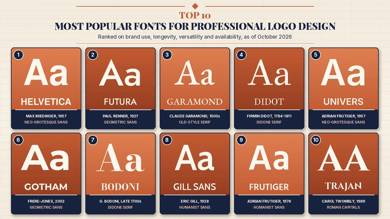
These popular fonts for logo design, from Helvetica to Trajan, show how ten classic typefaces shaped famous wordmarks and still guide brand identity today.
A logo usually has a fraction of a second to register, so the letters inside it carry a heavy load. Typeface choice signals era, price point and personality before anyone reads the words: a hairline Didone says fashion house, a geometric sans says engineered and modern, and Roman capitals say permanence.
This Finepedia guide, written as of October 2026, ranks ten typefaces that turn up again and again in professional logo work. For each one it explains who designed it and when, how it is classified, why designers reach for it, and which brand marks are documented as using it or a close derivative. Where a logo is only based on a typeface, or sources disagree, the text says so, and unconfirmed popular claims were left out.
How We Ranked the Fonts for Logo Design
Each typeface was scored from 1 to 5 on four equally weighted criteria, for a total out of 20. Scores are Finepedia's editorial judgement, applied with the same definitions to every entry and checked against foundry pages (Linotype, Monotype, Adobe Fonts, Hoefler&Co.), design-press reporting, Fonts In Use records and encyclopedic histories.
- Documented brand use (1 to 5): how many major logos, wordmarks or corporate identities are reliably recorded as using the family or an acknowledged derivative.
- Longevity (1 to 5): how long the design has stayed in active professional use, from its first release to today.
- Versatility and legibility (1 to 5): how well the letters hold up from a favicon or app icon to a billboard, in print and on screens.
- Availability (1 to 5): how easy it is to license the family legally, how many weights and languages it covers, and whether faithful free alternatives exist.
When totals tie, the higher Documented brand use score ranks first. Impact and Horizon, which appear in many older round-ups, were swapped out: Impact is far better known for internet memes and system-font use than for major corporate marks, and the name Horizon is shared by several unrelated display fonts, which makes its logo record hard to verify. Gotham and Gill Sans took their places because their brand histories are well documented.
The Scorecard
| Rank | Typeface | Brand use | Longevity | Versatility | Availability | Total |
|---|---|---|---|---|---|---|
| 1 | Helvetica | 5 | 5 | 5 | 4 | 19 |
| 2 | Futura | 5 | 5 | 4 | 4 | 18 |
| 3 | Garamond | 4 | 5 | 4 | 5 | 18 |
| 4 | Didot | 5 | 5 | 3 | 4 | 17 |
| 5 | Univers | 4 | 5 | 5 | 3 | 17 |
| 6 | Gotham | 5 | 3 | 5 | 3 | 16 |
| 7 | Bodoni | 4 | 5 | 3 | 4 | 16 |
| 8 | Gill Sans | 4 | 5 | 3 | 3 | 15 |
| 9 | Frutiger | 3 | 4 | 5 | 3 | 15 |
| 10 | Trajan | 3 | 4 | 2 | 4 | 13 |
Popular Logo Fonts at a Glance
| Rank | Typeface | Designer | First released | Classification | Documented logo or identity example |
|---|---|---|---|---|---|
| 1 | Helvetica | Max Miedinger with Eduard Hoffmann | 1957 | Neo-grotesque sans-serif | American Airlines logotype (1967 to 2013) |
| 2 | Futura | Paul Renner | 1927 | Geometric sans-serif | Louis Vuitton wordmark |
| 3 | Garamond | Claude Garamond (16th-century model; many revivals) | 1500s; ITC Garamond 1975 | Old-style serif | Apple Garamond (c. 1984 to 2002) |
| 4 | Didot | Firmin Didot | 1784 to 1811 | Didone serif | Harper's Bazaar logo (1992) |
| 5 | Univers | Adrian Frutiger | 1957 | Neo-grotesque sans-serif | eBay logo (2012) |
| 6 | Gotham | Tobias Frere-Jones with Jesse Ragan | 2002 (designed 2000) | Geometric sans-serif | 2008 Obama campaign graphics |
| 7 | Bodoni | Giambattista Bodoni | Late 18th century | Didone serif | Mamma Mia! posters (Poster Bodoni) |
| 8 | Gill Sans | Eric Gill | 1928 | Humanist sans-serif | BBC logo (1997 to 2021) |
| 9 | Frutiger | Adrian Frutiger | 1976 | Humanist sans-serif | NHS identity (core typeface) |
| 10 | Trajan | Carol Twombly | 1989 | Roman inscriptional capitals | Film posters such as Titanic (1997) |
1. Helvetica
| Attribute | Details |
|---|---|
| Designer | Max Miedinger, under the direction of Eduard Hoffmann of the Haas Type Foundry, Münchenstein, Switzerland |
| First released | 1957 as Neue Haas Grotesk; renamed Helvetica (Latin for Swiss) when Stempel and Linotype adapted it around 1959 to 1960 |
| Classification | Neo-grotesque sans-serif |
| Documented brand use | Lufthansa identity (1962), American Airlines logotype (1967 to 2013), BASF, Knoll; Jeep logo based on it |
| Licensing note | Commercial family now sold by Monotype; Nimbus Sans and TeX Gyre Heros are free look-alikes |
Helvetica is the default answer when people ask which typeface defines corporate modernism. Its tight spacing, large x-height and horizontal stroke endings give short words a dense, solid shape that reads as neutral and confident, which suited the airlines, chemical firms and furniture makers that adopted it in the 1960s.
Origins and History
Hoffmann wanted a new grotesque that could challenge Akzidenz-Grotesk, then dominant in Swiss printing, and Miedinger drew it in 1956 and 1957. The face debuted at the Graphic 57 printing fair in Lausanne in June 1957, the same show where Adrian Frutiger's Univers appeared. When Stempel and Linotype took it to machine typesetting, Linotype judged the original name unsuitable for the German market, and Helvetica was chosen instead. Linotype later licensed it to Xerox, Adobe and Apple, which put it inside PostScript printers and early Macintosh computers and pushed it into everyday office work.
Corporate identity programmes did the rest. Otl Aicher's team at the Ulm School of Design used it for Lufthansa in 1962, and Massimo Vignelli set the American Airlines logotype in it in 1967, an identity that survived until 2013. Neue Helvetica followed in 1983, and Monotype released Helvetica Now, with separate optical sizes, in 2019.
Key Features
- Horizontal and vertical stroke terminals that make words look compact and orderly
- Large x-height, so lowercase wordmarks stay readable at small sizes
- Very wide family, from hairline to black and from compressed to extended
- Strong association with the Swiss or International Typographic Style
- Mature hinting and screen versions after decades of digital use
Significance
Helvetica scores top marks on brand use because its record runs across transport, industry and retail for more than sixty years. The trade-off is familiarity. Because so many marks use it, a plain Helvetica wordmark can feel generic, so designers often tighten kerning, choose an unusual weight or modify one letter to make the mark distinctive and easier to protect as a trademark.
Interesting Facts
- Its fiftieth anniversary in 2007 was marked by Gary Hustwit's documentary Helvetica, which premiered at South by Southwest.
- Arial was created to match Helvetica's character widths, but many of its stroke endings are cut at an angle rather than horizontally.
- Apple used Helvetica, then Neue Helvetica, as the iPhone system font before moving to its own San Francisco family in 2015.
- The typeface is closely tied to New York City Subway signage and appears in Vignelli's 1970 subway map.
2. Futura
| Attribute | Details |
|---|---|
| Designer | Paul Renner, for the Bauer Type Foundry (Bauersche Gießerei), Frankfurt |
| First released | 1927 (sketches began in 1924) |
| Classification | Geometric sans-serif |
| Documented brand use | Louis Vuitton wordmark, Supreme box logo (oblique heavy weight), Absolut, IKEA's custom Futura until 2009; FedEx's custom letters are based partly on it |
| Licensing note | Futura is a registered trademark of Bauer Types in the UK, US and EU; Jost and League Spartan are free geometric alternatives |
Futura is the typeface of circles, triangles and squares. Renner built its capitals and lowercase from simple geometric shapes, then quietly corrected them so the forms look balanced rather than mechanical. In a logo, that construction projects precision and forward motion, which is why the face has served luxury fashion, streetwear, spirits and space exploration alike.
Origins and History
Renner developed Futura in the reformist climate of 1920s Germany, when designers associated with the New Frankfurt housing project and the Bauhaus wanted type stripped of ornament. Bauer marketed it as the typeface of the present day, and it sold so well that rival foundries released many imitations, including Spartan and Twentieth Century. Later additions widened its range: Futura Black, a stencil-like display design, arrived in 1929, and Edwin W. Shaar's Futura Extra Bold followed in 1952.
In the United States the face became a staple of advertising. Volkswagen's famous Think Small campaign of 1959 relied on it, and IKEA used a customised Futura for decades before switching its catalogue typography to Verdana in 2009, a change the Guardian reported as an uproar among designers.
Key Features
- Near-perfect circular bowls in letters such as o, b, d and p
- Sharp, pointed apexes on A, M, N and V
- Long ascenders and a small x-height that create an elegant, airy rhythm
- Large family including condensed, extra bold and display versions
- Strong presence in all-caps settings, the format of many fashion wordmarks
Significance
Futura's brand record is almost as broad as Helvetica's, and its geometric voice is more distinctive. Louis Vuitton's wordmark and Supreme's oblique heavy box logo show how the same family can feel exclusive in one context and rebellious in another. FedEx shows the derivative route: Lindon Leader of Landor Associates designed the 1994 wordmark with custom letters based on Univers and Futura, shaping the famous hidden arrow between the E and the x. Futura loses a point on versatility because its small x-height can look tight in long lowercase names at tiny sizes.
Interesting Facts
- The plaque left on the Moon by Apollo 11 in 1969 is set in Futura.
- Futura Extra Bold is widely cited as Stanley Kubrick's favourite typeface.
- The artist Barbara Kruger has used white Futura Bold Oblique on red bars in her text works since the late 1970s.
3. Garamond
| Attribute | Details |
|---|---|
| Designer | Model by Claude Garamond (c. 1510 to 1561), Paris; modern revivals by Monotype (1922 to 1923), Tony Stan (ITC Garamond, 1975) and Robert Slimbach (Adobe Garamond, 1989), among others |
| First released | 16th century in metal; digital revivals from the 1980s onward |
| Classification | Old-style (Garalde) serif |
| Documented brand use | Apple Garamond, a narrowed ITC Garamond, set beside the Apple logo from about 1984 to 2002 |
| Licensing note | Several commercial cuts exist; EB Garamond and Cormorant Garamond are free open-source revivals |
Garamond is less one typeface than a tradition. The name covers many serif designs that follow the elegant Renaissance romans cut in sixteenth-century Paris, with gentle stroke contrast, slanted stress and small, refined serifs. For logos it suggests heritage, literature and quiet quality, and because the letters were designed for reading, a Garamond wordmark rarely looks harsh.
Origins and History
Claude Garamond worked as a punchcutter in Paris, following a Venetian model cut for Aldus Manutius in the 1490s. His types spread across Europe and shaped book printing for generations. A complication sits inside the story: several famous twentieth-century Garamond revivals were actually based on the later work of Jean Jannon, whose 1621 specimen had been misattributed to Garamond. Beatrice Warde exposed the mix-up in 1926, after Monotype had already published its Garamond in the early 1920s.
Digital releases multiplied choices. Tony Stan's ITC Garamond of 1975 has a very tall x-height and tight spacing, while Robert Slimbach's Adobe Garamond of 1989 went back to Garamond's roman and Robert Granjon's italic after research at the Plantin-Moretus Museum in Antwerp.
Key Features
- Moderate contrast between thick and thin strokes, with diagonal stress
- Small, bracketed serifs that look calm rather than sharp
- Graceful italic companions, often modelled on Granjon
- Many revivals, from bookish text cuts to high-x-height display versions
Significance
Apple supplies the clearest corporate case. From the first Macintosh in 1984, the company used Apple Garamond, a version of ITC Garamond condensed to about 80 percent of its width and adjusted by Bitstream, for product names next to the logo and for campaigns including Think Different. Apple moved gradually to Myriad from 2002. Garamond scores slightly lower on brand use than the sans-serifs above because many viral claims about luxury logos set in Garamond are not confirmed by the brands or by foundry records, so they are not repeated here.
Interesting Facts
- The Garamond bundled with Microsoft Office is Monotype's 1920s design, which follows Jannon rather than Garamond himself.
- ITC Garamond divided critics because its tall lowercase and tight spacing look heavy in long text.
- Apple never released Apple Garamond for general sale; ITC briefly sold a close version called ITC Garamond Narrow.
4. Didot
| Attribute | Details |
|---|---|
| Designer | Firmin Didot (1764 to 1836), with printing by his brother Pierre Didot; modern cuts by Adrian Frutiger (Linotype Didot) and Jonathan Hoefler (HTF Didot, 1991) |
| First released | 1784 to 1811 for the classic Didot types |
| Classification | Didone (modern) serif |
| Documented brand use | Harper's Bazaar logo (1992), CBS Didot alongside the CBS eye, Zara's 2019 tightly kerned logo, long-running Vogue cover lettering in the Didot tradition |
| Licensing note | Commercial cuts from Linotype and Hoefler&Co.; GFS Didot is free, and Playfair Display is a free Didone-inspired design |
Didot is the look of the fashion magazine. Its strokes swing from heavy verticals to hair-thin horizontals, and its flat, unbracketed serifs look razor cut. Set large and black on a white page, a Didot wordmark feels expensive and theatrical, which is why fashion editors and luxury retailers keep returning to it.
Origins and History
The Didots were a dynasty of Paris printers and typefounders. Firmin Didot cut the best-known types between 1784 and 1811, taking cues from John Baskerville's experiments with high contrast and pushing the idea further. His brother Pierre printed with them, and Pierre's 1818 edition of Voltaire's La Henriade is often cited as a showpiece.
The twentieth century turned Didot into a fashion signature. Alexey Brodovitch used it at Harper's Bazaar in the mid-century, and Vogue used Didot on covers from the 1940s, adopting it permanently in 1955. In 1991 Harper's Bazaar commissioned Jonathan Hoefler to draw HTF Didot in multiple optical sizes for its redesign, so the hairlines would stay crisp even at enormous display sizes. The New Yorker reported that Fabien Baron introduced the new Didot logo in the September 1992 issue.
Key Features
- Extreme contrast between thick stems and hairline strokes
- Vertical stress and flat, unbracketed serifs
- Ball terminals on letters such as a, c and r
- Optical-size families that keep hairlines intact at large sizes
- Best in big, uncluttered layouts with generous white space
Significance
Didot earns full marks on brand use: magazine mastheads, a major television network and a global fashion retailer have built identities on it. CBS commissioned its own CBS Didot for use alongside the famous eye symbol, and the network began moving to TT Norms as its corporate font in 2020. Zara introduced a heavily kerned Didot-style logo in 2019. The weakness is versatility. Hairlines can vanish when a mark is shrunk to a social media avatar or printed on rough materials, so designers often pair a Didot wordmark with a simpler monogram for small uses.
Interesting Facts
- MoMA's design collection holds Hoefler's HTF Didot, recorded as a 1991 digital typeface.
- HTF Didot was made available for general licensing in 1996, years after the Bazaar commission.
- The New Yorker's 1993 profile of Fabien Baron described the early-1990s Calvin Klein CK logo as set in Didot, while other sources file it under Bodoni; both are Didone faces.
5. Univers
| Attribute | Details |
|---|---|
| Designer | Adrian Frutiger, for Deberny & Peignot, Paris |
| First released | 1957 |
| Classification | Neo-grotesque sans-serif |
| Documented brand use | eBay logo (2012), Audi Sans (a Univers-based corporate face), Munich Re custom version until 2009; FedEx custom letters based partly on it |
| Licensing note | Commercial family now held by Monotype; URW's U001 clone ships with Ghostscript under its own licence terms |
Univers is Helvetica's quieter rival. Both appeared in 1957 and both descend from nineteenth-century grotesques, but Univers was planned from the start as a complete, mathematically related system of weights and widths. In logos it gives a clean, engineered look that feels slightly more refined and less blunt than Helvetica.
Origins and History
Frutiger began sketching a grotesque family as a student in Zurich and developed it at Deberny & Peignot. Instead of names like bold or condensed, Univers used a numbering scheme: the first digit marks weight and the second marks width and posture, so 55 is the regular roman and 67 is a bold condensed. That logic influenced how later families were organised.
The design passed through Haas and Stempel to Linotype, and it is now part of Monotype. Frutiger reworked the whole family with Linotype in 1997, creating Linotype Univers with 63 fonts, and Univers Next followed in 2010 with true small caps and further extensions.
Key Features
- Even stroke weight with subtle thinning where curves meet stems
- Systematic numbering that makes weight and width choices predictable
- Slightly squarer, calmer forms than Helvetica
- Strong condensed styles that suit long brand names
- Core font in the PostScript 3 printing standard
Significance
Univers has a strong corporate record even if fewer people can name it. Fonts In Use documents the eBay logo introduced in 2012 as set in Univers. Audi's corporate typeface Audi Sans, drawn by Ole Schäfer when MetaDesign worked on the brand in the 1990s, is a Univers derivative, and FedEx's custom letters draw partly on it. Its clarity across sizes earns a full versatility score; availability is lower because good digital versions are commercial and the free clones are less complete.
Interesting Facts
- Frutiger summed up the contrast with Helvetica by calling Helvetica the jeans and Univers the dinner jacket.
- Apple used Univers, including a condensed oblique, on the keycaps of many of its keyboards.
- Frutiger also adapted Univers for IBM's Selectric Composer typewriter system in the 1960s.
6. Gotham
| Attribute | Details |
|---|---|
| Designer | Tobias Frere-Jones with Jesse Ragan, Hoefler & Frere-Jones (now Hoefler&Co.) |
| First released | 2002 (designed 2000 after a commission from GQ magazine) |
| Classification | Geometric sans-serif |
| Documented brand use | 2008 Obama campaign graphics, 2010 US Census identity, New York City FC logo (until 2024), Netflix brand typography (until 2018), National September 11 Memorial and Museum logotype (mixed with Verlag) |
| Licensing note | Commercial only, licensed through Hoefler&Co.; Montserrat is a popular free alternative with a similar spirit |
Gotham is the youngest typeface on this list and the one most associated with twenty-first-century branding. It has broad proportions, a generous x-height and open shapes, and it borrows its character from the plain lettering once painted and cast on New York buildings. In a logo it reads as honest, American and approachable without becoming cute.
Origins and History
GQ asked Hoefler & Frere-Jones for a geometric sans that would feel masculine and fresh. Frere-Jones looked at mid-twentieth-century architectural signs and engineering lettering rather than at 1920s European models, and the result was released in 2002. In 2004 Gotham was carved into the cornerstone of One World Trade Center, and it later expanded with Rounded, Narrow and Extra Narrow widths, plus Cyrillic and Greek in 2015.
Gotham became nationally famous through politics. Barack Obama's 2008 presidential campaign switched to it for signs and posters after early material used Perpetua, and similar typography later appeared in federal projects such as the 2010 census identity.
Key Features
- Wide letters with a high x-height and wide apertures
- Geometric but not rigid, with a slightly vernacular warmth
- Very large family of weights and widths, including rounded versions
- Holds clarity at small sizes and on screens
Significance
In barely two decades Gotham built a brand record that older faces needed half a century to collect. Netflix used it until 2018, when the company commissioned Netflix Sans from Dalton Maag to cut licensing costs, and New York City FC kept it on its logo until 2024, when two proprietary fonts by Frere-Jones replaced it. That pattern explains both its strength and its main limitation: big organisations love Gotham, but its commercial licence encourages the largest users to eventually commission their own type.
Interesting Facts
- Starbucks used Gotham in 2008 for a free-coffee offer to people who voted in the US presidential election.
- The 9/11 Memorial logotype designed by Landor Associates mixes Gotham with Verlag, another Hoefler & Frere-Jones face.
- A rounded version was first commissioned by Print magazine in 2007.
- Twitter moved twitter.com from Helvetica Neue to Gotham in May 2014, then reverted the change that September.
7. Bodoni
| Attribute | Details |
|---|---|
| Designer | Giambattista Bodoni (1740 to 1813), Parma; later revivals include Bauer Bodoni (Heinrich Jost, 1926) and Poster Bodoni (Chauncey H. Griffith, 1929) |
| First released | Late 18th century |
| Classification | Didone (modern) serif |
| Documented brand use | Mamma Mia! posters (Poster Bodoni), Nirvana logotype (Poster Bodoni Compressed), RMIT University logo; Giorgio Armani and Calvin Klein marks commonly cited as Bodoni-style |
| Licensing note | Many commercial cuts; Bodoni Moda is a free open-source revival |
Bodoni is Didot's Italian cousin. It shares the vertical stress, hairline serifs and dramatic contrast, but many Bodoni cuts feel a little rounder and more muscular. That range is useful for logo work: a light Bodoni can look couture-elegant, while Poster Bodoni and its compressed version look loud and theatrical.
Origins and History
Giambattista Bodoni ran the ducal press in Parma for most of his long career and kept refining his types. He built on John Baskerville's ideas about contrast and took them further, arriving at the crisp, high-contrast style now called Didone. His widow published his great specimen book, the Manuale Tipografico, in 1818.
Twentieth-century foundries produced many revivals. Heinrich Jost's 1926 Bauer Bodoni emphasised the hairline contrast, while Chauncey H. Griffith's Poster Bodoni of 1929 fattened the thick strokes for posters, with a compressed version following in 1938.
Key Features
- High contrast between thick stems and very thin serifs and hairlines
- Strong vertical axis and a formal, upright feel
- Wide range of cuts, from refined text versions to heavy poster weights
- Works best at display sizes in print or on high-resolution screens
- Instantly suggests fashion, editorial publishing and the arts
Significance
Bodoni's brand record includes entertainment as well as fashion. Mamma Mia! posters use Poster Bodoni, and the Nirvana logotype is usually identified as Poster Bodoni Compressed, a cut Bitstream confusingly sold under the name Onyx, according to Fonts In Use. Encyclopedic and museum sources also list Giorgio Armani and Calvin Klein among Bodoni users, though those custom marks are sometimes described as Didot. Like Didot, it scores lower on versatility because thin strokes struggle at very small sizes.
Interesting Facts
- RMIT University in Australia uses Bodoni in its logo.
- Canadian bookstore chain Chapters has used Bodoni for in-store signage.
- Bodoni's Manuale Tipografico appeared five years after his death in 1813.
8. Gill Sans
| Attribute | Details |
|---|---|
| Designer | Eric Gill, for the British branch of Monotype |
| First released | 1928 |
| Classification | Humanist sans-serif |
| Documented brand use | London and North Eastern Railway (from 1929), British Railways standard lettering, Penguin Books covers, BBC logo (1997 to 2021), Wikimedia Commons wordmark |
| Licensing note | Commercial family from Monotype; Cabin is a free family whose designer cites Johnston and Gill as inspiration |
Gill Sans is the British answer to Futura. It is based on Edward Johnston's 1916 lettering for the London Underground, and it mixes classical Roman proportions with a clean, unadorned stroke. For logos it signals trustworthy, slightly traditional Britishness, which is why broadcasters, railways and publishers used it for so long.
Origins and History
Gill had assisted Johnston in the early stages of the Underground alphabet. In 1926 he painted sans-serif capitals for a Bristol bookshop fascia, and Stanley Morison of Monotype, impressed by those letters, commissioned a full family as Monotype's reply to the wave of German geometric sans-serifs. It was an immediate hit: the London and North Eastern Railway adopted it in 1929 for posters, timetables and publicity, and British Railways later used it as the basis for station signs after nationalisation.
Key Features
- Classical proportions, with wide round letters and narrow ones such as E and S
- Distinctive lowercase forms, including a two-storey g with a spectacles shape
- Weights that vary noticeably in design, unlike strictly systematic families
- Elegant in capitals, which suits short names and signage
- Strong national and institutional associations in the UK
Significance
The BBC made Gill Sans part of its blocks logo in 1997, when designer Martin Lambie-Nairn argued that a time-tested face would not date quickly. It stayed until October 2021, when the corporation replaced it with its own BBC Reith typeface, citing a more modern look and ownership of the font. Brand owners today also weigh the documented abuse in Eric Gill's own diaries: Save the Children, for example, said in 2022 that it was moving away from Gill Sans as it updated its branding. Versatility is limited by uneven weights and a dense regular style that looks heavy at length.
Interesting Facts
- Gill Kayo, an ultra-heavy 1936 cousin, is often sold as Gill Sans Ultra Bold even though many letters differ.
- The LNER gave Gill a footplate ride on the Flying Scotsman to promote its new lettering.
- BBC Reith was developed with the Dalton Maag foundry and first appeared across BBC Sport in 2017.
9. Frutiger
| Attribute | Details |
|---|---|
| Designer | Adrian Frutiger |
| First released | 1976 by Stempel with Linotype, after the Roissy signage alphabet for Charles de Gaulle Airport |
| Classification | Humanist sans-serif |
| Documented brand use | NHS England identity (core typeface; organisation names in Frutiger Bold), Amtrak corporate font, Swiss road signs (ASTRA-Frutiger, from 2003) |
| Licensing note | Commercial family from Monotype (Frutiger, Frutiger Next, Neue Frutiger); open humanist sans families such as Fira Sans offer a similar tone |
Frutiger was designed to be read quickly from a distance by travellers in a hurry. Its open shapes, slight stroke modulation and clear letter differences make it one of the most legible sans-serifs ever drawn. In identity work it is the choice for organisations that want to look calm, clear and public spirited rather than fashionable.
Origins and History
The newly built Charles de Gaulle Airport at Roissy commissioned Frutiger around 1970 to 1971 to create a directional sign alphabet. He refined an earlier design called Concorde after legibility research and produced the Roissy lettering. Stempel and Linotype released the text version as Frutiger in 1976. It became so popular that in 2008 it was the fifth best-selling Linotype typeface. Frutiger Next followed for the Alte Pinakothek museum signage in the late 1990s, and Neue Frutiger, developed with Akira Kobayashi, arrived in 2009.
Key Features
- Wide apertures that keep letters like a, c, e and s open at small sizes
- Subtle humanist modulation that feels warmer than neo-grotesques
- Excellent distance legibility, tested on airport signage
- Large modern families covering many scripts in the World versions
- Neutral tone that suits health, transport and public services
Significance
Frutiger's brand history is mostly institutional rather than consumer. NHS England's identity guidelines name it as the core font and specify Frutiger Bold for organisation names beside the NHS logo, and Amtrak uses it as its corporate and signage font. It earns full marks on versatility because it remains legible from wayfinding signs down to small print. It ranks ninth because fewer famous commercial logos are documented in it, and its best versions are commercial licences.
Interesting Facts
- Designer Michael Bierut joked that Frutiger appears so often in hospitals and airports that it reminds him of bad news and missed flights.
- The Swiss Federal Roads Office adopted ASTRA-Frutiger, based on Frutiger 57 Condensed, for traffic signs in 2003.
- Sony's SST corporate typeface of 2013 was modelled partly on Frutiger and Helvetica.
10. Trajan
| Attribute | Details |
|---|---|
| Designer | Carol Twombly, for Adobe; Trajan Pro 3 expanded by Robert Slimbach in 2012 |
| First released | 1989 |
| Classification | Roman inscriptional capitals (serif, capitals only) |
| Documented brand use | Film posters including Titanic (1997), The Bodyguard and Scent of a Woman; university typography, book covers and campaign graphics |
| Licensing note | Available through Adobe Fonts and Fontspring; Cinzel is a free font inspired by first-century Roman inscriptions |
Trajan brings ancient Rome into a logo. Twombly based it on the monumental capitals carved at the base of Trajan's Column, a Roman triumphal column honouring the first-century emperor Trajan. Because the Romans did not use lowercase letters on such inscriptions, Trajan is a capitals-only face, which gives any name set in it a stately, carved-in-stone authority.
Origins and History
Adobe launched its in-house Adobe Originals type programme in 1989, and Trajan was one of its early releases. Twombly worked from a full-size picture of a rubbing of the inscription and produced a crisp, faithful translation of letters that calligraphers and type designers had admired for centuries. Because Trajan shipped with software many poster designers were starting to use, it reached Hollywood quickly. Typography writer Yves Peters told Vox that its film-poster debut came with At Play in the Fields of the Lord, followed by hits including The Bodyguard and Scent of a Woman.
Key Features
- Capitals only, with small capitals in the lowercase positions
- Classical proportions taken from Roman monumental lettering
- Fine, sharp serifs designed for display sizes rather than text
- Later versions add more weights, Greek and Cyrillic, plus Trajan Sans
- Pairs easily with simple sans-serifs for supporting text
Significance
Trajan ranks tenth because its most famous use is in film marketing rather than corporate logos, and its capitals-only design limits flexibility. Still, it fills a clear role: FILMdetail notes its use by universities such as Bologna, Kansas and Lausanne, on John Grisham book covers and in political campaigns, all places where permanence matters. Its very popularity became a problem. As Peters observed, overuse moved Trajan from awards-season dramas to horror and straight-to-video posters, so designers now customise or replace it when they want a classical mark that feels fresh.
Interesting Facts
- Titanic's 1997 poster is one of the best-known Trajan film titles.
- Twombly retired from Adobe and type design in 1999, but Adobe continued updating the family in consultation with her.
- Trajan Pro 3 does not include the long I or apex marks found in some Roman inscriptions.
Honourable Mentions
| Typeface | Designer and year | Why it is notable | Why it missed the top ten |
|---|---|---|---|
| Avenir | Adrian Frutiger, 1988 (Linotype) | Warmer geometric sans; principal typeface of the City of Amsterdam identity | Fewer documented major corporate logos than Futura or Gotham |
| Optima | Hermann Zapf, 1958 (Stempel) | Flared sans used for the Vietnam Veterans Memorial and the Expo 67 logo | Iconic in memorials, less common in modern wordmarks |
| Baskerville | John Baskerville, 1757 | Transitional serif; a modified version appears in the Government of Canada wordmark | Strong in publishing and government, narrower logo record |
| Proxima Nova | Mark Simonson, 1994 and revised 2005 | Popular web-era sans used by media and tech companies | Much of its use is in interfaces and body text rather than logos |
| Impact | Geoffrey Lee, 1965 (Stephenson Blake) | Ultra-condensed display face bundled with Windows since Windows 98 | Best known for meme captions; weak record in major brand marks |
Licensing, Trademarks and Free Alternatives
Using a famous typeface in a logo is normal, but it needs two kinds of care. The first is the font licence. Most commercial fonts are sold under an end-user licence agreement, and the terms decide where the font may be installed, how many people may use it, and whether it may be embedded in apps, websites or broadcast graphics. Desktop licences generally allow a logo to be drawn and then distributed as an image or outline file, but each foundry sets its own rules, so the agreement should be read before work begins. Fonts bundled with an operating system are not automatically licensed for every commercial purpose.
The second is trademark and originality. In the United States, the Copyright Office does not register typeface designs as such, but font software is protected, and a finished logo can be registered as a trademark. A plain word typed in a popular font is harder to protect and easier to confuse with rivals, which is why professional designers adjust spacing, modify letters or draw a custom logotype. Font names can be trademarks too; Futura, for example, is registered by Bauer Types.
Free and Open-Source Alternatives
| Classic typeface | Free alternative | Note |
|---|---|---|
| Helvetica | Nimbus Sans, TeX Gyre Heros | Close clones; Liberation Sans and Arial only match the widths |
| Futura | Jost, League Spartan | Geometric designs inspired by Futura, not identical |
| Garamond | EB Garamond, Cormorant Garamond | Open-source revivals of the Garamond style |
| Didot | GFS Didot, Playfair Display | GFS Didot follows the Didot model; Playfair is Didone-inspired |
| Univers | URW U001 (Ghostscript) | Check its licence terms before commercial use |
| Gotham | Montserrat | Similar geometric warmth, inspired by Buenos Aires signage |
| Bodoni | Bodoni Moda | Open-source revival with optical sizes |
| Gill Sans | Cabin | Humanist sans whose designer cites Johnston and Gill |
| Frutiger | Fira Sans, Source Sans 3 | Similar humanist tone, different designs |
| Trajan | Cinzel | Inspired by first-century Roman capitals |
Open-source fonts released under the SIL Open Font License can generally be used in commercial logos, but they are not exclusive, so a competitor can use the same family. Customising the final letters remains the best route to a distinctive, protectable mark.
Pairing Tips for Logo Systems
- Pair a high-contrast Didone logo with a clean sans for small text, for example Didot with Helvetica or Bodoni with Gotham.
- Use one family in several weights before adding a second family; Univers and Frutiger are built for this.
- Keep supporting text simpler than the logo so the mark stays the focal point.
- Test every logo at favicon size, on a phone screen, in one colour and reversed out of a dark background.
- Write the font names, weights, spacing and licence details into the brand guidelines so future designers do not substitute look-alikes.
Frequently Asked Questions
What are the most popular fonts for logo design?
Helvetica, Futura, Garamond, Didot, Univers, Gotham, Bodoni, Gill Sans, Frutiger and Trajan rank highest on this Finepedia list, scored on documented brand use, longevity, versatility and availability. Each has a long record in professional identity work, from airline logotypes and fashion mastheads to public-service brands and film posters.
Is it legal to use a famous font in a logo?
Usually yes, if the font is properly licensed. Most commercial foundry licences allow logo artwork made with the font, but terms differ, especially for apps, websites and broadcast use. Read the licence first, keep proof of purchase, and check that the finished logo does not imitate another company's trademark.
Why do so many luxury brands use Didot or Bodoni?
Didone typefaces have extreme contrast between thick and thin strokes, which looks crisp, formal and expensive at large sizes. Fashion magazines such as Harper's Bazaar and Vogue made the style a signature of the industry, and many fashion houses followed, often with custom versions adjusted for their names.
Should a new business use Helvetica for its logo?
It can, but plain Helvetica may look generic because so many brands use it. Designers usually adjust kerning, choose a distinctive weight or modify a letter so the mark becomes ownable. For a very small budget, a free close alternative such as Nimbus Sans can work, with careful attention to spacing.
What free fonts look like the classic logo fonts?
Popular open-source options include Jost for a Futura-like look, Montserrat for a Gotham-like feel, EB Garamond for Garamond, Bodoni Moda for Bodoni, GFS Didot or Playfair Display for a Didone look, and Cinzel for Trajan-style capitals. They are similar in spirit rather than exact copies, so test them carefully.
Did Rolex or other luxury brands really use Garamond?
Many online lists claim specific luxury logos are set in Garamond, but the brands rarely confirm their typefaces and many marks are custom drawn. This guide only names logo examples recorded in foundry, museum, design-press or encyclopedic sources, which is why several popular claims are not repeated here.
Conclusion
The most popular fonts for logo design share one quality: they have proved themselves across decades and very different brands. Helvetica and Univers delivered the neutral Swiss clarity of mid-century corporate identity, Futura and Gotham brought geometric confidence to fashion, politics and streaming, and Didot and Bodoni became the shorthand for luxury. Garamond, Gill Sans, Frutiger and Trajan each fill a more specific role, from literary heritage to public-service clarity and classical authority.
A typeface, however famous, is a starting point rather than a finished logo. The strongest marks on this list were licensed properly, adjusted carefully and tested at every size. For more Finepedia context on brand names and the history behind printed letters, see Most Expensive Handbag Brands in the World: Top 10, Inventions That Changed the World: Top 10 and Things to Know as a Business Owner: 10 Essential Lessons.
- Helvetica: Wikipedia summary of Helvetica history (Haas, Stempel, Linotype; Lufthansa 1962, American Airlines 1967 to 2013, BASF, Knoll, Jeep); Monotype product pages for Neue Helvetica and Helvetica Now; Gary Hustwit, Helvetica (2007 documentary)
- Futura: Wikipedia summary of Futura history (Renner, Bauer, 1927; trademark of Bauer Types); The Guardian, 2 Sept 2009, Verdana: Ikea's flat-pack font; Branding Reference, Logos Created with Futura; 99designs, Know your typeface: Futura; UCF Libraries research guide on Futura (Apollo 11 plaque, Volkswagen)
- FedEx logo: Wikipedia FedEx article, logo section (Lindon Leader, Landor Associates, 1994; custom letters based on Univers and Futura)
- Garamond: Wikipedia summaries of Garamond (Jannon misattribution, Monotype, ITC and Adobe revivals) and Apple typography (Apple Garamond, Myriad from 2002)
- Didot: MoMA collection record, Jonathan Hoefler, HTF Didot, 1991; Fonts In Use, HTF Didot; The New Yorker, 5 July 1993, Bing! It's Fabien!; Eye Magazine, Through thick and thin: fashion and type; Wikipedia Didot summary (Vogue, CBS Didot, Zara 2019)
- Univers: Wikipedia Univers summary (Frutiger, Deberny & Peignot 1957, Audi Sans, Munich Re, Apple keycaps); Fonts In Use, New eBay Logo (2012)
- Gotham: Wikipedia Gotham summary (GQ commission, One World Trade Center cornerstone, Obama 2008, Netflix, NYCFC); Hoefler&Co. notes on Gotham
- Bodoni: Wikipedia Bodoni summary; Fonts In Use, Poster Bodoni and Poster Bodoni Compressed; International Printing Museum, Wood Type Bodoni
- Gill Sans: Wikipedia Gill Sans summary (Monotype 1928, LNER, Penguin, BBC 1997, Save the Children 2022); BBC News, 19 Oct 2021, BBC reveals new logos in modern makeover; TypeRoom on BBC Reith
- Frutiger: Wikipedia Frutiger summary (Roissy, 1976 release, ASTRA-Frutiger, Amtrak); NHS England Identity Guidelines, Fonts and Organisational logos pages
- Trajan: Adobe Fonts, Trajan (Carol Twombly, 1989); Mental Floss, 2 July 2018, Why So Many Movie Posters Use the Same Typeface (Vox interview with Yves Peters); FILMdetail, Trajan: The Movie Font
- Honourable mentions: Wikipedia summaries of Avenir, Optima, Baskerville, Impact and Mark Simonson (Proxima Nova)
- Reference awareness: https://10mosttoday.com/10-most-popular-fonts-for-professional-logo-design/ (Sept 2019; unverified brand claims and dates corrected or left out)







Log in with