





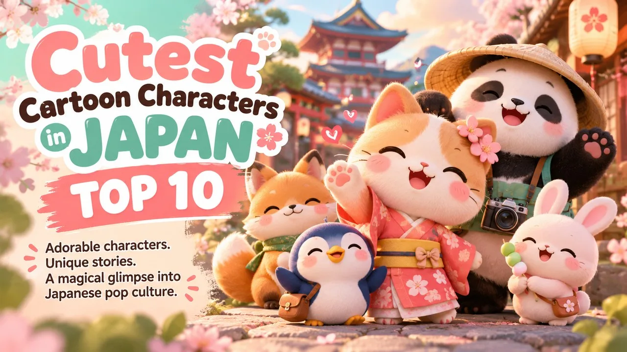
The cutest cartoon characters in Japan include Hello Kitty, Pikachu, Totoro, Chiikawa and Kumamon among ten verified kawaii icons as of October 2026.
Japanese popular culture treats cuteness as a design language, not only a childhood phase. The word kawaii covers soft shapes, big eyes, pastel colours and characters that invite care. Companies, prefectures, game studios and independent illustrators all use that language. Some icons sell stationery. Others sell games, films or tourism. A few began as social-media sketches and became nationwide merchandising waves within a few years.
This Finepedia listicle, written as of October 2026, picks ten of the cutest, most beloved cartoon and character designs from Japan. The mix spans Sanrio and San-X stationery characters, Pokémon and Kirby from games, Studio Ghibli animation, Fujiko F. Fujio manga, a prefectural yuru-chara mascot and the recent Chiikawa boom. Every debut year, creator credit and ranking figure below comes from official pages, company releases or reputable reporting dated in the Sources section. Rankings are fan votes or surveys, not scientific measures of beauty.
How We Chose These Cutest Cartoon Characters in Japan
We looked for characters that Japanese and international audiences already recognise as cute, with a clear origin story and ongoing cultural presence through 2024–2026. A strong entry needed a verified creator or rights holder, a dated debut, and evidence of lasting or rising popularity such as annual Sanrio Character Ranking results, long-running anime, game sales or documented mascot campaigns.
- Breadth: stationery, anime, manga, games and regional mascots
- Verifiability: Sanrio, Nintendo, Studio Ghibli, Kumamoto Prefecture, Kodansha or equivalent sources
- Currency: room for newer hits such as Chiikawa beside classic icons
- Neutrality: kawaii as design and commerce, without claiming one character is objectively the cutest
- Originality: a fresh order and framing, not a rewrite of older listicles
Characters that could not be checked against a primary or high-quality secondary source were left out, including viral claims without dates and invented award tallies.
Cutest Cartoon Characters in Japan at a Glance
| # | Character | Rights holder / origin | Debut (verified) |
|---|---|---|---|
| 1 | Hello Kitty | Sanrio | Designed 1974 |
| 2 | Chiikawa | Nagano / Kodansha manga | X sketch 2017; series account 2020 |
| 3 | Pikachu | The Pokémon Company / Nintendo | Pokémon Red and Green, 1996 |
| 4 | Cinnamoroll | Sanrio | Early 2000s (designer Miyuki Okumura) |
| 5 | Totoro | Studio Ghibli | My Neighbor Totoro, 1988 |
| 6 | Doraemon | Fujiko F. Fujio / Shogakukan | Manga debut December 1969 |
| 7 | Kirby | HAL Laboratory / Nintendo | Kirby's Dream Land, 1992 |
| 8 | Gudetama | Sanrio | 2013 |
| 9 | Kumamon | Kumamoto Prefecture | March 2010 |
| 10 | Rilakkuma | San-X | September 2003 |
Readers exploring related Finepedia topics on animals, myth and screen culture may also like General Knowledge Facts About Cats: The Fascinating World of Our Feline Friends, Top 10 Mythical Creatures in World Mythology - That Inspired Myths Across Civilizations, Most Powerful Witches in Harry Potter: Top 10 Ranked and Charlie Chaplin: Master of Comedy and Tragedy in Film.
1. Hello Kitty
| Attribute | Details |
|---|---|
| Full character name | Kitty White |
| Company | Sanrio Company, Ltd. |
| Designer | Yuko Shimizu (Sanrio illustrator, 1974) |
| Official birthday | 1 November (no birth year stated by Sanrio) |
| Profile notes | Cheerful girl; height and weight described in apples; London suburbs setting |
Hello Kitty is the face most people picture when they hear Japanese cuteness. Sanrio presents her as Kitty White, a cheerful girl who wears a ribbon on her left ear, not as a literal cat. The mouthless face lets fans project emotion onto her, which is one reason the design travels so easily across products and cultures.
Origins and History
Sanrio designer Yuko Shimizu created the character in 1974. Early merchandise included a coin purse aimed at Japanese girls. Corporate Sanrio pages still mark 1974 as the design year and list her birthday as 1 November. Over five decades she has appeared on stationery, apparel, theme parks, cafes and collaborations far outside toys. CNN Style reporting around her 50th anniversary in 2024 summarised industry estimates that place Hello Kitty among the highest-grossing entertainment franchises of all time, alongside names such as Pokémon and Mickey Mouse, with merchandise-led revenue rather than a single founding film.
Key Features
- Mouthless face that invites projection
- Red bow traditionally on the left ear
- Soft pastel colour stories and endless costume variants
- Official profile details such as apple-based height and weight
- Twin sister Mimmy in Sanrio lore
Significance
Hello Kitty helped turn character licensing into a global consumer language. For Finepedia readers, she anchors the cutest cartoon characters in Japan because she shows how a simple graphic can carry friendship branding, tourism ambassadorships and retail empires without needing a continuous TV plot. Sanrio also runs the annual Sanrio Character Ranking, where Hello Kitty remains a top-five regular even when newer characters take first place. International retailers still treat the ribbon and blank mouth as a flexible canvas for fashion collabs. That flexibility is why Hello Kitty can appear on a child's pencil case and an adult sneakers drop in the same season without changing the core face.
Interesting Facts
- Sanrio corporate English materials describe her dream as becoming a pianist or a poet.
- She has served in symbolic public roles, including as a special anime ambassador for Japan in earlier decades of cultural diplomacy.
- Designer Yuko Shimizu left Sanrio a few years after creating the character; later artists continued the brand look.
- In the 2025 Sanrio Character Ranking, Hello Kitty placed fifth overall on the official English results page.
2. Chiikawa
| Attribute | Details |
|---|---|
| Title meaning | Short for nanka chiisakute kawaii yatsu (something small and cute) |
| Creator | Illustrator Nagano |
| Early appearance | May 2017 post on X (then Twitter) |
| Dedicated serialisation | Official Chiikawa account from January 2020; Kodansha tankobon volumes from 2021 |
| Anime | Television adaptation from April 2022 (Doga Kobo) |
Chiikawa is the twenty-first-century proof that a tiny weeping creature can outrun older giants on social media. The cast of round animals works, studies, cries, eats and recovers. The humour mixes soft visuals with stressful adult feelings, which is why older teens and working adults collect the plush toys as eagerly as children do.
Origins and History
Nagano posted an early Chiikawa sketch in May 2017 about wanting to become a small creature that cries, runs away, sleeps and dances. A dedicated X account and web serial followed in 2020. Kodansha collected the comics into print volumes beginning in 2021. An anime adaptation began airing in April 2022. Nippon.com reporting in 2025 noted follower counts on the official account rising into the multi-million range and described Japan Character Award Grand Prix wins in 2022 and again in 2024. CyberAgent announced the global launch of the Chiikawa Pocket smartphone game on 27 March 2025 after more than two million pre-registrations across dozens of countries.
Key Features
- Extremely small, soft-edged animal designs
- Short gag strips that end in tears, food or dances
- Ensemble friends such as Hachiware and Usagi
- Heavy merchandising of plush, blind-box and apparel lines
- Cross-media moves into anime, games and brand collaborations
Significance
Among the cutest cartoon characters in Japan, Chiikawa shows how kawaii updated itself for smartphone timelines. The characters look gentle, but the stories admit exhaustion and fear. That emotional honesty, plus constant social posting, helped the property win mainstream character awards and expand into China, Southeast Asia and North America through pop-ups and apps. Pop-up stores in East Asia during 2024 showed how quickly a once-niche manga could fill mall queues. For Finepedia's purposes, that commercial surge is evidence of cuteness with staying power, not a prediction of next year's sales.
Interesting Facts
- By late 2024, Japanese reporting and publisher materials cited multi-million manga circulation including digital editions.
- Chiikawa won Japan Cartoonists Association Award recognition in the mid-2020s manga category cycle reported by secondary sources summarising Kodansha news.
- A CyberAgent release said Chiikawa Pocket topped free-app charts in multiple regions after launch day.
- Collaboration news in 2024–2025 included retail pop-ups and sports-event merchandising tied to MLB games in Tokyo.
3. Pikachu
| Attribute | Details |
|---|---|
| Species type | Electric Mouse Pokémon |
| Franchise creators | Satoshi Tajiri (concept); Ken Sugimori (art direction); Atsuko Nishida (Pikachu design) |
| Game debut | Pokémon Red and Green, Game Boy, Japan 1996 |
| Rights group | The Pokémon Company (Nintendo, Game Freak, Creatures) |
| Visual signature | Yellow body, red cheeks, lightning-bolt tail |
Pikachu is the electric mascot of Pokémon and one of the most recognised Japanese character silhouettes on Earth. The small mouth, round cheeks and high voice in anime adaptations made the design read as cute even when the games treat battles seriously.
Origins and History
Pokémon Red and Green launched in Japan in 1996 after years of development led by Satoshi Tajiri at Game Freak. Official Pokémon Company creator profiles credit Atsuko Nishida with designing Pikachu and Ken Sugimori with much of the franchise art direction. The television anime and trading-card game then made Pikachu a global face. Cosplay, stadium events and anniversary campaigns keep the character current far beyond the original 151 species roster.
Key Features
- Compact yellow body with cheek pouches that store electricity in lore
- High-pitched vocal presence in anime
- Evolves to Raichu with a Thunder Stone in the games
- Appears across games, cards, films and theme-park experiences
- Often used as the franchise ambassador in marketing
Significance
Pikachu proves that a game monster can sit beside stationery icons on any list of cutest cartoon characters in Japan. The design balances soft curves with a battle identity. Parents who never played the Game Boy titles still recognise the silhouette on lunchboxes and Olympic-era tourism ads. Stadium events, anniversary parks and endless plush variants keep the yellow rodent visible even in years when new Pokémon generations introduce competing starters. Cuteness and combat branding share one body.
Interesting Facts
- Early design talk reported in Japanese media linked Pikachu partly to small mammal and daifuku-like roundness ideas before the Electric Mouse typing locked in.
- The Pokémon Company manages licensing across games, anime and merchandise worldwide.
- Anniversary waves in the 2020s repeatedly featured Pikachu as the lead visual even when new generations introduce other starters.
- Competitive players may prefer other Electric types, yet casual culture still defaults to Pikachu.
4. Cinnamoroll
| Attribute | Details |
|---|---|
| Company | Sanrio |
| Designer | Miyuki Okumura |
| Debut era | Early 2000s (Baby Cinnamon naming phase leading to Cinnamoroll) |
| Look | White puppy with long ears that act like wings; curly tail like a cinnamon roll |
| Ranking streak | First place in Sanrio Character Ranking 2020–2024; second in 2025 |
Cinnamoroll is a flying puppy café mascot whose ears work like wings. Soft outlines, blushing cheeks and bakery themes made him a favourite for a generation that grew up after Hello Kitty's first wave.
Origins and History
Sanrio designer Miyuki Okumura created the character in the early 2000s. Japanese and English secondary sources summarise the debut path from Baby Cinnamon branding to the Cinnamoroll name still used today. From 2020 through 2024 he won five consecutive Sanrio Character Ranking titles, a streak widely covered by ORICON and Sanrio event reporting. In the 2025 ranking, official Sanrio English results listed Pompompurin first with 5,613,659 votes and Cinnamoroll second with 5,427,983 votes, inside a record total of 63,160,696 votes announced for that year.
Key Features
- Puppy body with ear-wings for floating travel in lore
- Cinnamon-roll curled tail
- Café and pastry story settings
- Ensemble friends such as Mocha, Chiffon, Espresso and Cappuccino in Sanrio materials
- Strong performance in both domestic and overseas ranking ballots
Significance
Cinnamoroll shows that Sanrio's cuteness pipeline did not freeze in the 1970s. On lists of the cutest cartoon characters in Japan, he represents the millennial and Gen Z Sanrio wave that also lifted Kuromi and Pompompurin. The five-year winning streak, followed by a near miss in 2025, is one of the best-documented popularity arcs in modern character marketing. Bakery aesthetics also travel well on social feeds: white fur, blue sky and pastry props photograph cleanly. Ranking campaigns reward characters that are easy to cosplay, draw and share.
Interesting Facts
- Sanrio FES event coverage for 2024 celebrated Cinnamoroll's fifth straight overall win.
- Pompompurin's 2025 return to first place ended a nine-year gap since that character's previous overall title, according to Sanrio's corporate Japanese release.
- Overseas country rankings published beside the main tally show how voting blocs differ by region.
- Café collaborations and plush lines keep the bakery theme visible in retail even between ranking seasons.
5. Totoro
| Attribute | Details |
|---|---|
| Film | My Neighbor Totoro (Tonari no Totoro) |
| Year | 1988 |
| Director / writer | Hayao Miyazaki |
| Studio | Studio Ghibli |
| Role today | Forest spirit and Studio Ghibli logo mascot |
Totoro is a giant, soft, grey forest spirit who roars more than he speaks. Children in the film meet him near a camphor tree. Adults watching decades later still find the design comforting rather than scary, which is rare for a creature of that size.
Origins and History
Studio Ghibli released My Neighbor Totoro in 1988. Hayao Miyazaki wrote and directed the film. Official Studio Ghibli materials present Totoro as the emblematic neighbour spirit of the story, and the studio later adopted a Totoro silhouette in its branding. The character never needed a toy-first origin; the film itself created the demand for plush toys, umbrellas and Catbus merchandise that followed.
Key Features
- Large round belly and leaf-topped head in many depictions
- Soft grey fur and wide grin
- Limited human speech; communication through sound and gesture
- Association with the Catbus and soot sprites in the same film world
- Calm, rural Japanese summer setting
Significance
Totoro belongs on any serious list of cutest cartoon characters in Japan because the design proves animation can sell gentleness without stationery logos. Environmental mood, sibling care and countryside quiet sit behind the smile. Museums, parks and global Ghibli releases keep introducing new viewers every year. Parents who first saw the film on VHS now introduce it on modern discs and streams, which keeps Totoro inside living-room culture rather than only museum culture.
Interesting Facts
- The film shares a famous 1988 double-bill history with Grave of the Fireflies in Japanese theatrical memory, though the tones differ sharply.
- Totoro plush toys became durable export items long before streaming made Ghibli catalogues easier to find abroad.
- Art books and Miyazaki interviews describe the creature as deliberately ambiguous rather than a tidy mythological citation.
- Small, medium and large Totoro variants appear together in the film, multiplying the cute silhouettes.
6. Doraemon
| Attribute | Details |
|---|---|
| Creator | Fujiko F. Fujio |
| Manga debut | December 1969 across Shogakukan children's magazines |
| Long-running anime | Shin-Ei Animation series from 1979; refreshed 2005 series continues |
| Look | Blue robotic cat from the future; four-dimensional pocket |
| Publisher roots | Shogakukan / related multimedia companies |
Doraemon is a blue robotic cat who travels from the future to help a schoolboy named Nobita. The design is simple: round head, big eyes, red nose, empty space where ears once were in lore, and a pocket full of gadgets. Japanese children grew up treating him as a friend more than a machine.
Origins and History
Fujiko F. Fujio's Doraemon manga began in December 1969. A short 1973 television adaptation existed, but the enduring anime identity formed with the 1979 Shin-Ei Animation series and later the 2005 renewal that still airs. Government and cultural explainers, including Highlighting Japan features, describe Doraemon as a soft-power symbol taught abroad and celebrated at home through films, museums and school-age readership.
Key Features
- Blue colour (earlier print colour stories exist, but blue became standard)
- Four-dimensional pocket producing gag gadgets
- Friendship arc with Nobita and classmates
- Annual feature films alongside the TV series
- Instantly readable silhouette even at small icon size
Significance
Doraemon's cuteness comes from roundness and loyalty. On this Finepedia list he represents manga-native characters that later became national brands. Unlike stationery-only icons, he carries decades of weekly storytelling, which keeps emotional attachment high across generations of Japanese families. Classroom and living-room familiarity matters: many Japanese adults can hum the theme before they can name modern streaming hits. That deep memory is a form of soft power as well as cuteness.
Interesting Facts
- Cultural diplomacy campaigns have used Doraemon as an anime ambassador figure in past Japanese foreign-ministry initiatives.
- Museum and anniversary exhibitions in Japan regularly rotate original art and gadget replicas.
- The gadget comedy format influenced later kid-hero shows without copying the exact design.
- International broadcasts localised names and snacks, but the blue cat outline stayed stable.
7. Kirby
| Attribute | Details |
|---|---|
| Debut game | Kirby's Dream Land |
| Platform / year | Game Boy; Japan release 27 April 1992 |
| Developer | HAL Laboratory |
| Publisher | Nintendo |
| Creator | Masahiro Sakurai (first directed game) |
Kirby is a pink puff who inhales enemies and copies their abilities. The design is almost a circle with feet and blush marks. That simplicity is the point: anyone can read the silhouette in a second, which is why the character ages well on handheld screens and modern consoles alike.
Origins and History
HAL Laboratory released Kirby's Dream Land in Japan on 27 April 1992. Masahiro Sakurai directed the game as an early career project; development materials note the working name Popopo before Kirby stuck. Nintendo Life and other retrospectives mark the title as the start of a long series of platformers, spin-offs and the later Super Smash Bros. appearances that introduced Kirby to players who never owned a Game Boy.
Key Features
- Nearly spherical pink body
- Inhale and copy ability gameplay hook
- Floating and sliding moves that feel soft rather than violent
- Cheerful musical themes across the series
- Wide age rating accessibility compared with many action heroes
Significance
Kirby sits with Pikachu as proof that Japanese game characters can define cuteness without Sanrio licensing. The circle body is pure graphic design. Among the cutest cartoon characters in Japan, Kirby also shows how difficulty can hide behind a gentle face: later games add deep mechanics while keeping the same friendly orb. Accessible difficulty options in later releases also protect the friendly brand: new players can enjoy the pastel worlds without the skill walls that define many other platformer mascots.
Interesting Facts
- Early Western box art sometimes shifted Kirby's colour, but pink became the lasting global standard.
- Sakurai later created Super Smash Bros., repeatedly including Kirby in the fighter roster.
- The series' thirtieth anniversary coverage in 2022 revisited the Dream Land origins for new players.
- Fan culture celebrates Kirby both as a baby-like mascot and as a surprisingly efficient in-game predator.
8. Gudetama
| Attribute | Details |
|---|---|
| Company | Sanrio |
| Debut | 2013 |
| Name roots | Gudegude (lazy / lethargic) + tamago (egg) |
| Personality | Apathetic, tired, reluctant egg yolk character |
| Appeal | Adult humour inside a kawaii shell |
Gudetama is a lazy egg yolk who would rather lie on bacon than try harder. Sanrio launched the character in 2013, and the joke landed with office workers who saw themselves in the slumped posture. Cuteness here comes from resignation, not pep talks.
Origins and History
Sanrio's official character page presents Gudetama among its modern roster, with 2013 as the debut year widely cited across Sanrio materials and encyclopaedic summaries. Short animated sketches and social posts spread the egg's deadpan lines. The character later appeared in rankings, collaborations and a live-action-tinged Netflix series adaptation announced in the early 2020s, extending the brand beyond stationery.
Key Features
- Egg-white body with a yolk face
- Constant tired posture and minimal effort gags
- Food-tray settings and kitchen props
- Humour aimed at stressed adults as much as children
- Still clearly Sanrio-cute in line weight and blush
Significance
Gudetama expanded what kawaii could mean. Not every cute Japanese character needs to be cheerful. On this list of cutest cartoon characters in Japan, the lazy egg stands for millennial burnout comedy packaged as a plush toy. That emotional niche helped Sanrio reach shoppers who felt Hello Kitty was too sweet but still wanted soft design. Short looping animations of an egg refusing to move are perfect for crowded train timelines. The character's humour is brief, repeatable and still unmistakably Japanese in its food pun.
Interesting Facts
- The name is a transparent Japanese pun that travels well once explained.
- Viral clips often show Gudetama refusing tasks in a few seconds, which suited early smartphone feeds.
- Later Sanrio rankings still list Gudetama among the larger cast even when top-ten slots go to classic dogs and cats.
- Food-character elections and special Sanrio events occasionally spotlighted egg and dessert designs as a group.
9. Kumamon
| Attribute | Details |
|---|---|
| Type | Official yuru-chara (loose / gentle mascot) of Kumamoto Prefecture |
| Debut | 12 March 2010 (public birthday used in prefecture materials) |
| Purpose | Tourism and regional promotion ahead of Kyushu Shinkansen full opening |
| Look | Black bear with red cheeks and wide oval eyes |
| Breakthrough vote | First place, Yuru-Chara Grand Prix 2011 (about 287,000 points in contemporary reports) |
Kumamon is a surprised-looking black bear who promotes Kumamoto Prefecture. Unlike corporate stationery characters, he began as government tourism marketing. The free licensing approach and constant public appearances turned a local campaign into a national mascot phenomenon.
Origins and History
Kumamoto Prefecture introduced Kumamon in March 2010 while preparing for the full opening of the Kyushu Shinkansen. Japan News and prefectural anniversary coverage in 2025 marked fifteen years since debut and credited creative input connected to catchphrase work by Kundo Koyama, with design development involving creative director Manabu Mizuno in commonly cited accounts. In November 2011 Kumamon won the Yuru-Chara Grand Prix; contemporary Japanese tech-press tallies put the winning score at 287,315 points. Merchandising and event income for the prefecture jumped in the years after that win, a rise documented in English explainers from Web Japan and later BBC Future features on the mascot economy.
Key Features
- All-black body with bright red oval cheeks
- Wide eyes that read as constant surprise
- Public dance routines and surprise street appearances
- Tourism and reconstruction messaging after the 2016 Kumamoto earthquakes
- Open licensing model that encouraged local businesses to use the character
Significance
Kumamon proves regional governments can create cutest-tier icons. He belongs on a Japan character list beside Sanrio because yuru-chara culture is part of the same kawaii economy. Visitors meet him at stations, airports and festivals, which ties cuteness to place branding rather than only to private IP. After natural disasters, the same face appeared in recovery messaging, which complicated the idea that mascots are only toys. Cuteness became a tool for morale as well as souvenirs.
Interesting Facts
- Prefects and governors have posed with Kumamon as a semi-official sales partner for years.
- Anniversary reporting in 2025 emphasised overseas fan outreach as the next growth target.
- Recognition surveys cited in Japan News anniversary coverage claimed extremely high domestic awareness by the mid-2020s.
- The bear design does not map to a famous local wild species story; officials adopted it anyway and won the public over.
10. Rilakkuma
| Attribute | Details |
|---|---|
| Company | San-X |
| Creator | Illustrator Aki Kondo |
| Debut | September 2003 |
| Name meaning | Blend of relax (rirakkusu) and kuma (bear) |
| Companions | Korilakkuma and Kiiroitori |
Rilakkuma is a brown bear who appears in a human's apartment and then mostly lounges. San-X launched the character in September 2003, created by Aki Kondo. The brand sells the fantasy of doing nothing productive, wrapped in soft plush textures.
Origins and History
San-X anniversary materials for Rilakkuma's twentieth year recount the 2003 debut and the later arrival of white companion Korilakkuma and yellow bird Kiiroitori. Japan Times feature reporting has described how the lazy-bear lifestyle theme resonated with tired workers. Picture books, plush toys, cafes and a Netflix stop-motion series extended the brand without turning Rilakkuma into an action hero.
Key Features
- Zipper on the back in lore (suggesting a costume mystery)
- Relaxed posture and honey motifs
- Companion characters that expand gift-set merchandising
- Calm colour palette of browns, creams and soft yellows
- Lifestyle branding more than battle plots
Significance
Rilakkuma closes this Top 10 by representing San-X rather than Sanrio, reminding readers that Japan's cute industry has multiple major houses. Together with Gudetama, the bear shows adult stress relief as a design brief. Among the cutest cartoon characters in Japan, Rilakkuma remains a stationery and plush staple more than twenty years after launch. The brand rarely chases battle narratives; it sells permission to pause. In a list about cuteness, that emotional offer is as important as eye size or pastel fill colours.
Interesting Facts
- San-X ran twentieth-anniversary campaigns and special site content around the 2023 milestone.
- Korilakkuma's own anniversary messaging in later years underlined how companion characters refresh a mature IP.
- Cafe collaborations emphasise desserts and slow afternoons rather than adrenaline.
- The zipper lore gives fans a gentle mystery without dark storytelling.
How These Characters Compare
| Character | Medium first | Best known for | 2024–2026 note |
|---|---|---|---|
| Hello Kitty | Merchandise design | Global licensing icon | Still top-five in Sanrio Character Ranking 2025 |
| Chiikawa | Social manga | Tiny stressed animals | Anime ongoing; Chiikawa Pocket app launched March 2025 |
| Pikachu | Video game | Pokémon franchise face | Continues as lead marketing mascot worldwide |
| Cinnamoroll | Merchandise design | Café puppy with ear-wings | Five straight Sanrio ranking wins 2020–2024; second in 2025 |
| Totoro | Feature film | Ghibli forest spirit | Remains studio emblem for new streaming audiences |
| Doraemon | Manga / TV anime | Future-cat helper | Long-running TV films keep family viewership |
| Kirby | Handheld game | Pink inhale hero | Series still expands on modern Nintendo hardware |
| Gudetama | Merchandise / shorts | Lazy egg comedy | Adult burnout humour inside Sanrio cuteness |
| Kumamon | Prefecture mascot | Tourism bear | Fifteenth-anniversary overseas push reported in 2025 |
| Rilakkuma | Merchandise / books | Relaxed San-X bear | Café and streaming spin-offs sustain the brand |
Cuteness here is not a single formula. Stationery characters win by blank expressions fans can fill. Game characters win by readable silhouettes under pixel and polygon limits. Film spirits win by mood. Mascots win by dancing in stations. The shared craft is emotional safety: each design invites care before it asks for combat, homework or a purchase.
When marketers say a property is kawaii, they usually mean the first glance feels friendly. That glance still has to survive decades of reprints, remasters and ranking campaigns. The ten profiles above are the ones that did, with dates you can check.
Frequently Asked Questions
What does kawaii mean for cartoon characters?
Kawaii is Japanese for cute, but in design it also means approachable, soft and emotionally safe. Big eyes, rounded shapes, pastel colours and characters that seem to need care are common tools. Brands use those tools across toys, apps, tourism and fashion.
Is Hello Kitty a cat?
Sanrio presents Hello Kitty as Kitty White, a little girl who looks feline, not as an animal character in the strict sense. The company has repeated that framing for years. Fans still call her a kitty in everyday speech because of the ears and whisker dots.
Who is winning recent Sanrio Character Rankings?
Cinnamoroll won overall first place from 2020 through 2024. In 2025, Sanrio's official English results named Pompompurin first and Cinnamoroll second, with more than 63 million total votes counted for that edition.
Why include Kumamon on a cartoon list?
Kumamon is a yuru-chara mascot rather than an anime protagonist, but he is still a designed cartoon character with nationwide recognition. Prefectural mascots are a major branch of Japanese character culture and belong beside studio and stationery icons.
Is Chiikawa only for children?
No. The comics and anime attract many adult fans because the jokes mix cute drawings with stress, failure and recovery. Merchandise lines and the 2025 Chiikawa Pocket app launch targeted a wide age range across multiple countries.
Are these the only cute Japanese characters?
Far from it. My Melody, Kuromi, Pompompurin, Jibanyan, Anpanman and many Game Freak or Studio Ghibli side characters could fill another list. This Top 10 balances classics, current chart leaders and one regional mascot for 2026 readers.
Do rankings prove which character is cutest?
No. Sanrio Character Ranking and yuru-chara contests measure organised fan voting and campaign energy. They are useful popularity signals with dated totals, not scientific beauty scores. Finepedia treats them as evidence of attention, not absolute truth.
Conclusion
The cutest cartoon characters in Japan succeed because designers treat softness as a serious craft. Hello Kitty and Cinnamoroll show Sanrio's long retail power. Chiikawa proves social-native comics can still break through. Pikachu and Kirby carry game logic inside round bodies. Totoro and Doraemon bring film and manga warmth. Gudetama and Rilakkuma sell rest. Kumamon sells a prefecture with a bear's surprised face.
Together they map kawaii from 1969 manga pages to 2025 app launches. For readers comparing culture topics on Finepedia, the lesson is practical: verify debut years, credit creators, and date every ranking before calling any character the cutest of all time.
- Sanrio Hello Kitty character and corporate brand pages — https://www.sanrio.co.jp/characters/hellokitty/ — https://corporate.sanrio.co.jp/en/business-info/brands/hello_kity/
- Sanrio Character Ranking 2025 official English results — https://www.sanrio.co.jp/special/characterranking/2025/en/
- Sanrio Character Ranking 2024 results hub — https://www.sanrio.co.jp/special/characterranking/2024/result/
- Sanrio corporate release on 2025 ranking (Pompompurin first; record vote total) — https://corporate.sanrio.co.jp/news/assets/pdf/2025/20250629234414182s.pdf
- Sanrio Gudetama character page — https://www.sanrio.co.jp/characters/gudetama/
- CNN Style, Hello Kitty 50th anniversary feature (31 Oct 2024) — https://www.cnn.com/2024/10/31/style/hello-kitty-50th-anniversary-japan-hnk-intl
- Official Pokémon creator profile materials on Pikachu's designers — https://www.pokemon.com/us/news/creator-profile-the-creators-of-pikachu
- Studio Ghibli My Neighbor Totoro film page — https://www.ghibli.jp/works/totoro/
- Highlighting Japan / government explainer on Doraemon cultural reach — https://www.gov-online.go.jp/eng/publicity/book/hlj/html/201902/201902_07_en.html
- Nintendo / series histories for Kirby's Dream Land (27 Apr 1992 Japan) summarised in reliable game press such as Nintendo Life retrospectives
- Japan News (Yomiuri), Kumamon 15th anniversary report (Apr 2025) — https://japannews.yomiuri.co.jp/features/japan-focus/20250405-246901/
- Web Japan Trends piece on Kumamon popularity — https://web-japan.org/trends/11_culture/pop130812.html
- ITmedia Netorabo contemporary report of Yuru-Chara Grand Prix 2011 result (Kumamon 287,315 points)
- Nippon.com in-depth on Chiikawa's rise — https://www.nippon.com/en/in-depth/d01122/
- CyberAgent English release on Chiikawa Pocket launch (27 Mar 2025) — https://www.cyberagent.co.jp/en/news/detail/id=31589
- San-X Rilakkuma 20th anniversary materials — https://www.san-x.co.jp/rilakkuma/20th_anniversary/
- ORICON coverage of Cinnamoroll's five-consecutive Sanrio Character Ranking wins through 2024
- Yanase Takashi Memorial Hall / Anpanman history pages (background on Japanese children's heroes; Anpanman not a Top 10 entry here but useful kawaii context) — https://anpanman-museum.net/yanase/english.html
- Reference topic prompt only (not copied): 10mosttoday "10 Cutest Cartoon Characters in Japan" (26 Aug 2019) — https://10mosttoday.com/10-cutest-cartoon-characters-in-japan/












Log in with